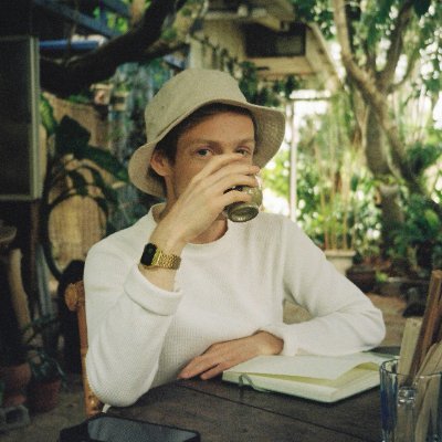
Illustrator / Painter https://xitter.cf/t.co/bR1j8WhcH2
Amsterdam
Joined March 2009
- Tweets9.3K
- Following825
- Followers22.3K
- Likes27.1K




Timo Kuilder retweeted

In the early days of GTA1 development, the driving just wasn’t fun.
Then Pat Kerr, who is handy with physics but wasn’t even on the team, dropped in some driving code that fixed it.
He’s now published a playable demo using those same ideas. It’s remarkable how much it feels like GTA1—especially the handbrake (space).
patkerr.co.uk/2d-vehicles/

Timo Kuilder retweeted

Working on a very cool blue MS-DOS theme for Omarchy with @timokuilder
Released on Monday!

Timo Kuilder retweeted

This says mostly what I can’t because I’ll just seem butt hurt. But this review read really badly. Just felt like I was reading from someone who had a personal vendetta against…a scheduling app? Because he hated scheduling???
The whole anti-AI thing doesn’t offend me as much any more because these folks clearly haven’t met a client in the past 3 years. Especially when you’re the studio that’s been at like the bleeding edge of it. People ask us to use it. It’s not weird any more. We try, sometimes it works sometimes it doesn’t.
The comments being like they delivered too much? Come on guys. Sure it’s a lot of brand assets but I’m not asking anyone to use them ALL AT ONCE. It’s just giving them options for the future. Can’t tell you how many clients are like shit all we have is a nice font and some quirky illustration. Not to mention we did hand off a like 200 page style guide on how to use everything.
Anyway, I am butt hurt about this review. Wish it was done by someone who had any idea what the current design industry looks like now.
Also love to get taken to task on AI by a dude that has black rock in his portfolio.

this points to what I'm talking about here.
I'm not just getting on to defend mike but design and brand in tech are moving so fast that it has such a specific set of considerations that most traditional brand designers are often not thinking about.
there are actually people in the comments saying that smith and diction delivered too big of a brand that will be too hard to manage.
the truth is, nearly every client I work with is coming to me because they hired a freelancer or agency who handed off a brand book that lacks a world with no range or library of visual expression.
tech co's like calendly generally have pretty large and talented brand teams and are able to execute on whatever you throw at them. they don't hire you for a flimsy PDF that stops at the logo, colors, and type.
s&d also get dinged here for saying that the symbol is just a cool C. in traditional brands, the symbol is yoked with the expectation of telling the full story. these days, creating a unique, scalable, identifiable symbol is the name of the game and the story is told with the balance of the brand. tech brands have a specific set of constraints around symbol application that aren't necessary true for brick and mortar or DTC brands.
I digress as I'm not saying anything groundbreaking here, it just has to be frustrating for people designing for tech that the only site reviewing brands is coming at them from an angle that often fails to understand how these brands will ultimately be used (not really their fault, just the truth of the matter). of course the critique would be mid even if the brand isn't at all.

Timo Kuilder retweeted
my friends @niekdekker and @timokuilder made this nice card game, go get it.


Timo Kuilder retweeted

'Scavengers Reign' co-creator Joe Bennett has confirmed on Instagram that Netflix will not be renewing the series for a second season.
He posted a teaser produced at Green Street Pictures showing what was to come in season 2 if the show had been able to continue.


Timo Kuilder retweeted

First round of samples for Balance are in, and they look amazing. This WoB set with striking Klein Blue accents aims to encourage mindfulness. While it may be just a keycap set, I truly believe that the objects around us can subtly influence our state of mind, even subconsciously.
The novelties, beautifully illustrated by @timokuilder, interpret key words and phrases associated with mindfulness practice.
Modifiers have been thoughtfully replaced with words like Release, Unlock, and Adapt, designed to inspire reflection and mindfulness.
The Alphas are crafted to symbolize balance, reflecting the idea that life comprises both smooth and rough moments.
I wanted each legend to be felt to emphasise tactically and presence so decided to go with ABS plastic with UV printed legends. Working with @keyreative_ on this project has been so enjoyable. The quality is amazing and they are just really nice people!


Timo Kuilder retweeted

Ok, so for the first time I’m going to be releasing from my vault of unreleased music
We are launching @vaultdotfm to show music has inherent value beyond just exposure
Subscribe to unlock 👇
Timo Kuilder retweeted

Took me a hot minute but blend states in @rive_app are great fun. A blast from the past but an interactive Silly Robot. Play here: rive.app/community/8920-1705…
Timo Kuilder retweeted

Start building a business where creativity can, and will, change your life.Jump into the captivating world of creativity and entrepreneurial spirit with ‘Creativity for Sale’. counter-print.co.uk/products…

Timo Kuilder retweeted

Fuji Bank by Landor Associates, 1988
#logos #branding #logodesign #designhistory #graphicdesign #designinspiration #japan #japanesedesign #logoarchive


Timo Kuilder retweeted

my husband has been taking sailing lessons and instead of putting it on our calendar like a normal person he prefers to stand up abruptly, stare out the window, and proclaim "I must go to the sea!"
Timo Kuilder retweeted

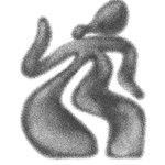
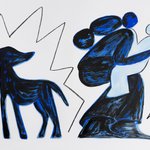
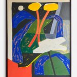
🎨 @timokuilder is an Amsterdam-based illustrator that uses simple shapes to tell stories
His creativity is fueled by nature and his own curiosity
Take a look inside his studio to see where he created previous work for clients like The New York Times and Google 👇


Timo Kuilder retweeted

Om mijn geloof in de linkse samenwerking en het overstijgen van partijgrenzen nog meer kracht bij te zetten, ben ik lid geworden van de PvdA.
Op naar een verenigd links, voor mens én natuur.