

Pinned Tweet
All you ever wanted to know about using proper color contrast for interfaces. ✨

Make your design life 10X easier and use these 5 color contrast score ranges for specific UI elements.
👇Here's the breakdown...
(I started writing this after the recent @usecontrast launch)


Yay or nay?
What if you could click on the display in @usecontrast to generate these little color swatch frames on the canvas.
Helpful?


Contrast retweeted

Made a video about these contrast scores. Watch it here: youtube.com/watch?v=ULUNaH-G…
Contrast retweeted
Until then, if you haven't tried @usecontrast yet, go do it! It's free and it's awesome. usecontrast.com/
I guess this is technically now an @adobe product. 😜

Contrast retweeted
I have a bunch of stuff queued up to keep talking about @usecontrast and some solid guidelines for ideal contrast ratios for specific pieces of UI, beyond just pass/fail.
But with all the other design news™ I'm gonna wait until next week.

💅 Just fixed a bug in the Figma plugin where the background color could be wrong if there was an object directly next to the selection.

🤔👇
Want to use the new @usecontrast for @figma RIGHT AWAY or want to wait a little while longer?
Video shows what's not ready. (poll in next tweet)
That’s hot.
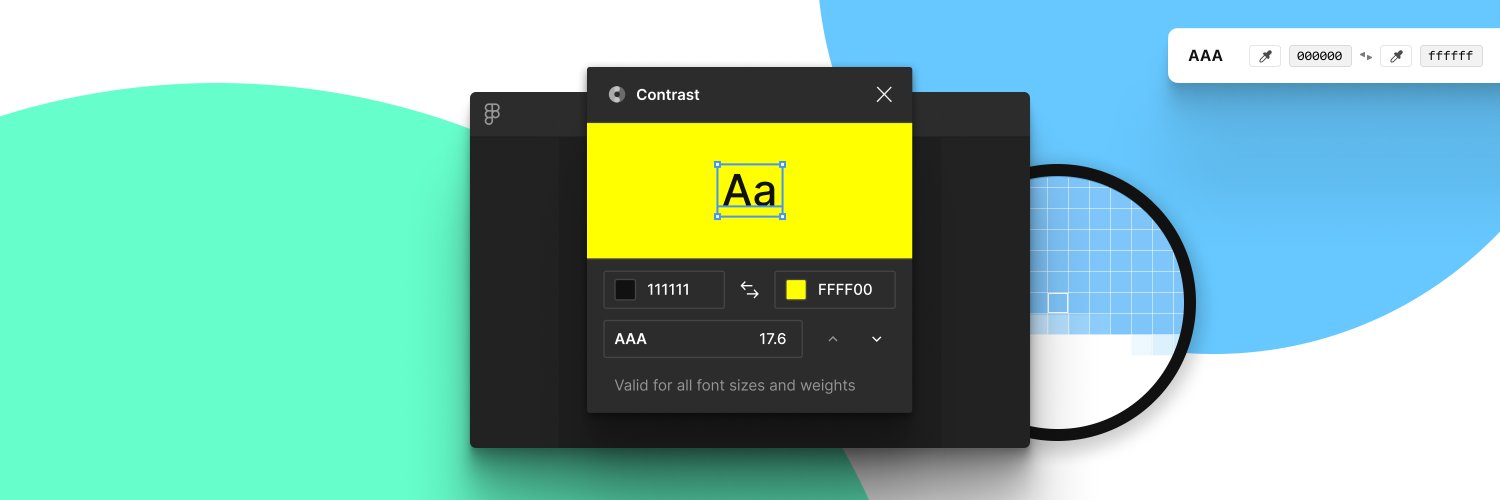
Look at this absolute magic @gusso is sprinkling into @usecontrast. ✨
This is selecting foreground or background and holding holding down an arrrow key.

gotta new lil' website for the upcoming @figma plugin launch. usecontrast.com/
Contrast retweeted

We’re putting *so many* decisions inside such a tiny package, which is by far my favourite type of project.
99.1% now!
So @gusso has been working hard and has the @usecontrast like 99% ready to ship. It turned out sooooo much better than I originally hoped and it's already incredibly useful as is. 🔥