






Thomas retweeted


Celebrating small wins is hardwired into "Achieve," our goal-tracking sample app.
We wanted the simple act of checking off a task to feel like a celebration. Instead of the standard #Material ripple, we used Styles to drop in a custom, high-contrast completion animation—specifically, a brand-colored ring that expands and fades on tap, paired with a subtle pressed-state gradient.
It lets us focus entirely on polishing those custom, rewarding micro-interactions while Material handles the foundation.
#GoogleDesign #MaterialDesign #JetpackCompose #AndroidDev #UXDesign #InteractionDesign
Thomas retweeted

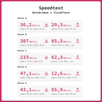
Das ist ein DeutschlandLAN Connect IP 1000. Der größte reguläre Tarif, den es bei der Telekom gibt mit 1000 Mbit up UND down. Und es reicht nicht mal mehr für DNS-Abfragen. #peeringmatters


Thomas retweeted

DAS HABT IHR NOCH NIE GESEHEN! Trubin köpft Benfica in 90'+8 gegen Real Madrid in die #UCL-Playoffs! #DAZNmoment


Thomas retweeted

man kann halt wirklich nur in GElsenkirchen über tage hinweg mit schwerstem gerät ein riesen loch in ne sparkasse bohren und 3000 schließfächer knacken und die anwohner 3m weiter denken sich bei dem lärmpegel nur „joa wird schon seine richtigkeit haben zu weihnachten“

Da soll nochmal jemand sagen dass man mit Handwerk kein Geld verdienen kann! #Sparkasse #Gelsenkirchen #Bohrer


Thomas retweeted

consistency ≠ uniformity:
for those who haven't lived through this era – we used to have beautiful, precision interfaces. now they're replaced by a design language that originated from the Apple Watch, with icons that only fit in squircles. but that's not even the point.
the point is we used to design the whole stack – the technology, the concepts, the interfaces. when designers only care about superficial consistency, platforms lose their uniqueness.
apple used to design systems. skeuomorphism wasn't just about leather textures – it was about teaching people new mental models. the trash can empties because you understand what a trash can does. aqua's lickable buttons and sheets had depth because the OS had layers you could understand. the old apple designed the whole stack – from metal to pixels to concepts. teams weren't just shipping features in the same box, they were building coherent platforms each with opinions about what computing should feel like for the medium.
liquid glass is fine on a phone. but on macOS it's unusable – lack of precision, visual noise everywhere. this is what happens when UI language designed for fingers bleed into macOS. we went from interfaces designed for a 27" cinema display with a precise cursor to interfaces designed for a 1.5" screen you tap with one finger.
the Mac is for creation and precision work. it needs information density. it needs chrome you can grab. it needs UI that gets out of your way but gives you power when you need it. instead we got padding and whitespace and translucent blurs optimized for touch targets nobody's touching.
the squircle icon mandate is a symptom. when you force every icon into the same shape, you're saying "brand consistency" matters more than "each app icon needs to communicate its function instantly." we traded clarity for uniformity. we traded precise design for cross-platform sameness.
consistency means your system has coherent rules within itself. uniformity means everything looks the same regardless of context.
the hardware team still gets it – that macbook pro + M-series chips, chef's kiss. but software design feels like it's chasing fat fingers instead of remembering what people do on a Mac.


Thomas retweeted

The "Get Started" button on the Mac OS Tahoe Welcome screen is the most disabled-looking button I was ever forced to click.


Thomas retweeted

The rest of us are out here A/B testing our checkout screens but this is what it looks like to try and purchase a Windows license and Microsoft is the second most valuable company in the world 🤡
Thomas retweeted

Hey Google, stop stuffing your iOS apps with the entire Material Library and bloating them to the size of a Windows XP ISO.
It still looks awful compared to native iOS UI.


Thomas retweeted

„Ich kann es nicht nachvollziehen. Es war unabsichtliches Handspiel, aber es war eben Handspiel. Der Ball wäre ins Tor gegangen“, sagt Julian Nagelsmann. Der Bundestrainer ist „stolz“ auf seine Mannschaft und betont: „Ich hatte das Gefühl, dass in jeder Sekunde jeder aus dieser Gruppe Bock hatte. Das war nicht immer so. Es tut weh. Weh, so auszuscheiden. Auch weh, dass wir zwei Jahre warten müssen, bis wir Weltmeister werden. Das wollen wir. Das ist jetzt unser Ziel.“
Nagelsmann richtet zudem einem bemerkenswerten Appell an die Nation: „Unser Land verfällt stetig und ständig in Tristesse und Schwarzmalerei. Es war schön, dass wir den Menschen in diesen Wochen gemeinschaftlich ein paar schöne Momente bescheren konnten. Ich hoffe, dass sich diese Symbiose aus Fußballmannschaft und Fußballfans generell auch auf unsere Gesellschaft überträgt. Dass wir begreifen, dass wir gemeinsam mehr bewegen können als wenn jeder sein eigenes Süppchen kocht!“
🇩🇪 @SkySportDE

Thomas retweeted

Germany have been robbed.
Can anybody give me a reason why it was not a handball?
These silly English referees are ruining football.
Ridiculous and pathetic!
#ESPGER
xitter.cf/TheEuropeanLad/status/…


