
Macro strategist at Bloomberg writing for the Markets Live blog. Former macro HF PM. Always on the hunt for pink flamingos.
Westport and Gotham
Joined January 2017
- Tweets3.2K
- Following61
- Followers10.5K
- Likes654


Cameron Crise retweeted

“Can you feel the tension? I can. I can feel it down in my plums.”
👉 super70ssportsstore.com/prod…


Cameron Crise retweeted

Oh man. I have to admit, Cameron Crise's (@5thrule) AI-powered Fed tune really is a banger... suno.com/song/a5e40e87-2631-…


Cameron Crise retweeted

Re last RT: No good reason for Moyes to speak so negatively about a kid going through a really difficult time.

The whole FTX saga actually makes perfect sense if you think of SBF and Caroline Ellison as literal incarnations of Seth and Mclovin from Superbad
This week I was pleased to be a guest on the Macro Hive podcast with @bilalhafeez123. We had a great chat about life, the financial universe, and everything. You can check it out here:
macrohive.libsyn.com/cameron…

Cameron Crise retweeted

This week, @PatrickCeresna and @kevinmuir welcome Cameron Crise @5thrule to the show to discuss the current macro environment, exploring the constraints faced by global Central Banks, and what that means for the market & end with an out-of-the-box surprise you don’t want to miss.
Is there anything dumber than the market reacting strongly to a comment downplaying the chances of consistent 75 bp moves 40 mins after a 75 bp move that was breezily dismissed 6 weeks ago?
Retail wondering where easy trading profits have gone...

Cameron Crise retweeted

Our latest Alpha Exchange episode
Cameron Crise, Macro Strategist, Bloomberg - alphaexchangepodcast.com/epi…
via @podcastpage
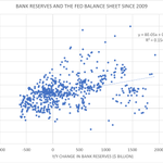
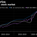
With Fed QT around the corner, you're going to be subjected to plenty of analysis about the reversal of balance sheet growth and what it means. A lot of it will look like the chart below...please pardon the 3 axes (will explain reason for them below)

...you find a relationship, but it's not quite as compelling as the naive overlay chart from a visual perspective. But in a sense, that's the point. It gives you a better idea of how QT might impact things than the overlay.