

Type is face, Type is voice. For Japanese posts: @typeproject Instagram: @typeproject_official
Tokyo
Joined April 2025
- Tweets183
- Following8
- Followers71
- Likes0




‘One such treatment is adding a small amount of spacing at the boundaries where Latin and numbers are mixed with Japanese to make the text easier to read.’
Web Font Design Technique 06:
“Automatically Add Spacing Between Japanese and Latin”
staffblog.typeproject.com/en…

The October font in our smartphone wallpaper series is JunMaru Mincho. A rounded Mincho typeface with low stroke contrast, it has a plump, mellow character. Its heavier and lighter weights feel quite different, but we recommend them all! staffblog.typeproject.com/47…

We’ve updated the 'Fonts In Use' section on our website. typeproject.com/en/fontinuse


‘“The text size is set at 13.5Q, with an astonishing 14H character spacing!” These are quotes from the text, and I believe that some readers may find themselves scratching their heads, while others may nod in agreement.’
[TP Staff Blog]
staffblog.typeproject.com/en…

‘When exporting fonts as final files (OTF), Glyphs references its internal database and converts the NiceName to a name (Production Name) that complies with the Adobe Glyph List Specification.’
[TP Staff Blog] “NiceName in Glyphs”
staffblog.typeproject.com/en…

We’ve updated the 'Fonts In Use' section on our website. typeproject.com/fontinuse

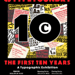
CJ Type is a type foundry run by graphic and type designer CJ Dunn. The exhibition features posters, books, and printed matter made with CJ Type typefaces, plus “72 Microseasons,” a calendar featuring kanji, hiragana, katakana, and English in Ruvett Pixel, its latest typeface.
Type event: New York-based type foundry CJ Type celebrates its 10th anniversary in Tokyo. The exhibition runs Sep. 30–Oct. 2 at ibuchi in Kichijoji. Opening reception: Sep. 30, 6–8 PM. Closing party: Oct. 2, 6–8 PM. instagram.com/p/DdQ9xADtCWQ/

A taste of AXIS Round.
More on Instagram: instagram.com/typeproject_of…
Font info: typeproject.com/en/fonts/axi…
‘With all glyphs for TP Apricot now complete and its release approaching, a discussion arose as to which category to classify this typeface under on the company website’s search page.’
TP Apricot Development Story 09: Classification of Typeface
staffblog.typeproject.com/en…

The September font for our smartphone wallpaper series is TP Meigetsu, inspired by the moon in the autumn sky. The visual created by lining up the character “つ” almost looks like a photograph capturing the moon’s trail across the night sky. Give it a try! staffblog.typeproject.com/47…

‘fonts that do not have CIDs assigned to them (name-keyed fonts), such as Latin fonts, have string-based names assigned to each glyph. For example, “A” is “A,” “a” is “a,” and “1” is “one.”’
[TP Staff Blog] “Latin Fonts and Glyph Names”
staffblog.typeproject.com/en…

‘Therefore, for katakana, I created two prototype designs: one leaning toward upright to match kanji and hiragana, and another incorporating the inclination of Latin for a slightly more dynamic feel.’
TP Apricot Development Story 08: Design of Katakana
staffblog.typeproject.com/en…

The smartphone wallpaper page has been updated. Featuring TP Sky Modern. Blk (Black), pushed to the limit of boldness. UL (Ultra Light), so delicate it could melt away. Resonating with words of every temperature, it gives each one the right contours. staffblog.typeproject.com/47…

‘the TP Apricot has different people in charge of hiragana and katakana. I believe that in many Japanese fonts, one person is in charge of both hiragana and katakana.’
[TP Staff Blog]
TP Apricot Development Story 07: Design of Hiragana
staffblog.typeproject.com/en…

‘Actually, there are two different definitions of “glyph.” Perhaps a more general explanation would be something like “the specific shape of a character.”’
[TP Staff Blog]
Character Names and Glyph Names 04: “Glyph and CID”
staffblog.typeproject.com/en…

Hama Mincho incorporates into its design the “cityscape of Yokohama” as seen from the sea, including the three Yokohama towers—King, Queen, and Jack—which once served as landmarks for sailors, as well as Osanbashi Pier, the Red Brick Warehouse, and the Landmark Tower.


Previously, I raised the question: “Why does the same character appear with either one-dot or two-dot ‘Shinnyo’ radical depending on the font?”
[TP Staff Blog]
Character Names and Glyph Names 03
The One-Dot ‘Shinnyo’ Radical and Two-Dot ‘Shinnyo’ Radical
staffblog.typeproject.com/en…

‘Apple made the decision to abandon hinting long before the introduction of Retina displays, with the release of “Mac OS X (10.0)” back in 2001. Since hinting corrections may slightly change the outline shape, this option avoids said deformation.’
staffblog.typeproject.com/en…

We’ve added Artizon Museum, Ishibashi Foundation (artizon.museum) to the Fonts In Use section on our Web site. The font used is AXIS Font.
typeproject.com/en/fontinuse…


