

(he/him) artist, writer, King of the Wild Frontier. Orbital Blues, Wayward Stars, Public Access, Hull Breach, PNW Nils and more. personal @spicedwoodsman
bleeding splish-splash show
Joined October 2011
- Tweets10.8K
- Following316
- Followers1.4K
- Likes90.3K





Pinned Tweet
tinywoodsman 2024 portfolio!
I'm open for work and looking to take on new, shorter scale projects! I've done lots of #TTRPG work, music work, all kinds of display stuff and lots of other random things! If you like my stuff, hit me up! I'm good, fast and would love to chat!


A pair of election posters created for #OrbitalBluesAfterburn. Can't wait to see how these turn out in person.


I'd love to talk more granularly about all this. Maybe a new video in the future?

The first way to get text to look handwritten is to actually write it! This is my using a tablet to write something out myself. This only takes care of 1/5 of the entries on here though, as they all need to look different. 2/8

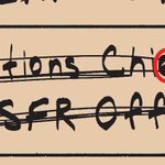
The main thing to remember is variety! Vary the thickness of lines, to indicate different pens, vary the spacing of letters, vary the angle of text (rarely do people write in an exact straight line) and vary the size of letters. 7/8

A personal pet peeve of mine is handwritten text that clearly looks like a non-diegetic font. I used a few tricks on this piece to ensure I got a number of different entries that all lookeds closer to handwritten
It's not perfect of course, but here's a few tricks I use.
1/8


