

Content design at Meta. Serial hobbyist. Late diagnosed ND. Mom to write home about. I make art and I know things. Are you gonna eat that? she/her
MA
Joined September 2010
- Tweets488
- Following643
- Followers335
- Likes3.6K

A purchase confirm dialog shouldn’t have a red CTA. This is a dark pattern, @InsideRoblox. Blue signals success, red signals error or destructive action. This a pretty blatant strategy to get low literacy or low attention users (ahem, children) to make duplicate purchases. Gross.

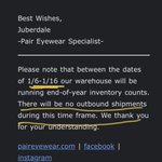
In the year of our direct to consumer lord 2023. An online DTC eyewear company has to stop all shipments for 10 days? To do…inventory? 🫠

My only conspiracy theory is that there’s never been a child named Donna. They all spawned from customer service desks far and wide as fully formed middle aged women.
Intense. Ha. “@darrylohrt: Who knew the Salvation Army branding was so badass?? instagr.am/p/DHifF/”
T. Eleganz retweeted

DDC1701: Be thankful. We are lucky to do this stuff. #1D4D
@allergictougly @ryantomorrow 1. I'd steal the shit out of that baby. 2. Billy Joel isn't really optional, sorry sister.