

Independent type foundry striving for thoughtful and functional typography. https://www.instagram/r.v.type
Joined January 2021
- Tweets40
- Following59
- Followers77
- Likes41




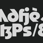
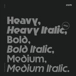
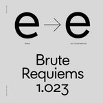


Our typeface Striated is in this year's Yearbook of Type by Slanted Publishers among many other great foundries and type designers. Grab the typeface -> r-vtype.com
#fonts #thedailytype #graphicdesign #lettering #typography #designfeed #typedesign #type #fontdesign


Road to Venice Type retweeted

This (probably) original piece by Adrian Frutiger explain a lot why we are charmed by pencil filling ✏️like @TypeLettering uses 🤗 all the time in our digital world.

We've added a subtle—not-so-subtle axis to drive some new ligatures in No. 3 Series Variable.✨ Trial fonts –> r-vtype.com
#logo #logotype #fonts #thedailytype #graphicdesign #typography #typefacespecimen #designfeed #typedesdign #type #fontdesign #variablefont
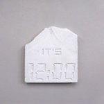
7-segment-display numerals in stone. A study from some time ago.
#fonts #thedailytype #graphicdesign #lettering #typography #designfeed #typedesdign #type #fontdesign #brutalism


No. 3 Series got reworked. It became more robust and versatile. –> r-vtype.com
#logo #film #titles #credits #logotype #fonts #thedailytype #graphicdesign #typography #typefacespecimen #designfeed #typedesdign #type #fontdesign


Striated comes in six styles and lends itself for smooth animations like these.✨
#logo #logotype #fonts #thedailytype #graphicdesign #typography #designfeed #typedesign #type #fontdesign #kinetictype #animation #animatedtype #coding #python
Road to Venice Type retweeted

harvesting words, france, 15th century

ALT a medieval illustration of man and woman amongst a field of scattered letters as big as their heads. the man is picking up a fistful of the letters to add to a pouch he's holding, while the woman is bent over, using a tool that resembles a rake to scoop more letters up.
Striated got alternate letters, ligatures, arrows, case sensitive forms and became a variable font. Get the trial fonts on –> r-vtype.com
#logo #logotype #fonts #thedailytype #graphicdesign #typography #typefacespecimen #designfeed #typedesdign #type #fontdesign


We're releasing Striated. A mixture between a grotesque and geometric typeface. Trial fonts -> r-vtype.com
#logo #logotype #fonts #thedailytype #graphicdesign #typography #typefacespecimen #designfeed #typedesdign #type #fontdesign #typeface


We've added more features to the display side of Rhizome. Closed apertures add a Grotesk flavour and you can write in encapsulated text. Trial fonts -> r-vtype.com
#fonts #graphicdesign #typography #variabletype #designfeed #typedesdign #type


Thanks to the great Slanted for letting us write a bit about No. 3 Series!

No. 3 Series ift.tt/3Fmo9bQ
Road to Venice Type retweeted

Albert Klijn, gouache logo sketch for a steel window company, Amsterdam.

Ligature extension for No. 3 Series.🙂🙃Prices stay the same and owners of a license can download the update via the link they received. r-vtype.com #fonts #graphicdesign #typography


Rhizome is a variable font now! Next to being a functional typeface, it lends itself for all sorts of things, including making animations like this one. #fonts #graphicdesign #typography #coding #variabletype
Rhizome grows up and shifts toward a more pure geometric typeface. Furthermore, it got an extra weight, an adjusted weight curve and its figure set extended. Designers, get our trial fonts at r-vtype.com #type #typography #graphicdesign #typedesign #displaytype


No. 3 Series is largely influenced by writing. For example the a,d,p and q are derived from rotated italic letters written with a broad-nibbed pen. This becomes more apparent with increasing compression. #roadtovenicetype #type #typography #graphicdesign #typedesign #displaytype


No. 3 Series is available. First licensees get a free specimen by mail. #roadtovenicetype #type #typography #graphicdesign #typedesign #displaytype


