
Retype is a digital type foundry based in the Hague, the Netherlands. #TypeDesign #Typography
The Hague
Joined January 2012
- Tweets5.4K
- Following2.5K
- Followers4.9K
- Likes8.5K
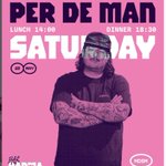


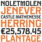


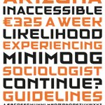


Good designers making impactful brands with Brutal Types' fonts. Check this KarmaKebab.nl graphics designed by lennertstok.com using our Kraai font. brutaltypes.com/fonts/kraai


Introducing Tramstop, a font inspired by the lettering found at a former tram station located at Verspycklaan 1 in Naaldwijk, the Netherlands. brutaltypes.com/fonts/tramst…


Retype Foundry retweeted

Hay una cultura tóxica que está saliendo de la industria de la IA y que intenta constantemente que dejemos de pensar.
El mensaje está por todos lados. No leas el código, simplemente hacé vibe-coding. No intentes entender todo el texto, dejá que la IA te lo resuma. No te molestes en educarte, ya es demasiado tarde.
No te preocupes por los errores. Confiá en que todo se va a arreglar en la próxima versión.
El tema es siempre el mismo: no pienses demasiado. Solo seguí tragando bazofia.

There's a toxic culture coming out of the AI industry that keeps trying to get us not to think.
The message is everywhere. Don’t read the code, just vibe-code. Don’t try to understand all the text, just let AI summarize it. Don’t bother educating yourself, it’s too late.
Don’t worry about the errors. Trust that everything will be fixed in the next version.
The theme is the same. Don’t think too hard. Just keep swallowing the slop.

Introducing Aktie, a display typeface designed by P. Mastrangelo and R. Espinoza, inspired by the alphabet created by Dutch designer Anton Kurvers, for the architecture book series Moderneschoonheid, published by Kosmos Uitgevers between 1931 and 1933. brutaltypes.com/fonts/aktie


Introducing Edisonplein, a display typeface inspired by the lettering at the entrance of the former “Gemeenteschool J. voor GLO” a Dutch public school located at Edisonplein 20–46 in Schiedam, the Netherlands. brutaltypes.com/fonts/edison…


We strongly recommend this interview with Floor Wesseling, one of the most original voices in Amsterdam’s graphic design scene: brutaltypes.com/news/floor-w…

Introducing Brikka, a modular display typeface inspired by the lettering painted into the brick wall of the former yarn manufacturer Goudsche Machinale Garenspinnerij, located along the Turfsingel in Gouda, the Netherlands. brutaltypes.com/fonts/brikka


Introducing Marien, a modular, neo-constructivist display typeface inspired by a piece of 1930s lettering found on a façade stone at Mariënburg 92 in Nijmegen, the Netherlands. brutaltypes.com/fonts/marien


Introducing Urgell, a display typeface inspired by a vintage Deco-style street sign located at Comte d’Urgell 16 in Barcelona, Catalonia.brutaltypes.com/fonts/urgell


Retype Foundry retweeted

Move the furniture, roll up the carpet, let's dance and sing along to this classic:
'When That Man Is Dead And Gone', superb lyrics written by Irving Berlin in 1941, sung by Mildred Bailey:
youtu.be/9ZhI19z7s2M?si=sgMs…

Introducing Paysbas, a modular typeface designed by Ramiro Espinoza and inspired by the lettering used to identify the Dutch Pavilion at the 1925 Exposition internationale des arts décoratifs et industriels modernes in Paris. brutaltypes.com/fonts/paysba…


Introducing Minicus, a compressed modular typeface designed by Paula Mastrangelo and inspired by the lettering on a plaque at Tweede Jan Steenstraat 113 in Amsterdam, the Netherlands. brutaltypes.com/fonts/minicu…


Introducing Limonade, a font inspired by the tiled, modular lettering on the façade of the former Limonade factory P. Verlaan & Zn, located at Venestraat 56 in Leidschendam, the Netherlands. brutaltypes.com/fonts/limona…


Introducing Baksteen, a modular typeface inspired by the lettering on the façade of a former public primary school in Leiden. brutaltypes.com/fonts/bakste…


Retype Foundry retweeted

If you are interested in being a good musician never take the easy way. Some tutorial online giving you the easy way, no. Practice hard til your body and brain are exhausted and fulfilled. Do it everyday alot. Learn from the bottom up. Do it everyday day until you die
New at Brutal Types: Baruch is a geometric sans typeface inspired by the modular, lettering found on the cover of the technical handbook Gereedschappen en gereedschapswerktuigen voor metaalbewerking, published in Haarlem in 1938. brutaltypes.com/fonts/baruch


New interview: Two minds, one voice: Inside the creative world of The Stone Twins > re-type.com/news/2025/11/12/…


New font at Brutal Types: Kunsthandel, inspired by the distinctive letterforms found in a well-known woodcut created by Dutch artist t Chris Lebeau (1878–1945) brutaltypes.com/fonts/kunsth…
