

Packaging of the World welcomes you to browse through the selection of the world's best, most creative and interesting package design finds!
Worldwide
Joined July 2009
- Tweets10.5K
- Following1.7K
- Followers23K
- Likes4.4K




Sliced cheese, shaped like the tool that cuts it. 🧀
The die-cut panel carries the handle, the bold black wordmark sits above a generous window, and the slices stack up behind clear film.
packagingoftheworld.com/2026…
#packagingdesign by L'Alchimiste Agence de design Paris


ÁNIMA gives each bottle its own creature, drawn in soft, grainy #illustration that sits somewhere between a dream and a nocturnal field guide.
packagingoftheworld.com/2026…
#labeldesign by Estudio ARGO


Light on its feet.
PLIÉ is a concept #icecream brand where a loose line-drawn dancer lets the scoop become her tutu.
packagingoftheworld.com/2026…
#packagingdesign by Alina Sergazieva


A river you can see through.
S34 #Gin turns the Río de la Plata into a #diecut gold-foiled label, letting the glass become the water.
packagingoftheworld.com/2026…
#labeldesign by Nevin Ynga Pozzoli

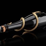
Temptation, coiled in gold. 🐍
One bottle. One bite. No going back.
packagingoftheworld.com/2026…
1+1 Brut Limited Edition Apple Cider #packagingdesign by Alexander Skurikhin

Four pouches, four characters, one bold outline. Each bag gets its own hair, its own top pattern and its own expression, and the clear window becomes the mouth or nose, so the #candy inside is part of the face.
packagingoftheworld.com/2026…
#packagingdesign by neo creative studio


Castle Freke sits in its own amber glow. A warm metallic cross stopper crowns a rounded bottle, while a bare tree in foil climbs the glass from the base.
packagingoftheworld.com/2026…
#gin #packagingdesign by Deep, Design Agency


FICTICIO is an #agavespirit with an invented origin.
packagingoftheworld.com/2026…
Peel one layer back and another story waits underneath.
#labeldesign by HI Estudio


Two Ingredients pairs #handinked illustration with bold red labels and warm kraft paper. Oversized brush lettering names each shape, while a tone-on-tone embossed seal and fine gold foil details reward a closer look.
packagingoftheworld.com/2026…
#pasta #packagingdesign by Affogato


FID is an #Irishwhiskey concept shaped like a #standingstone. Smoked glass, glowing amber and gold-filled glyphs give the bottle the presence of something found in the landscape, not placed on a shelf.
packagingoftheworld.com/2026…
#packagingdesign by Backbar studios


A trumpet player made of engraving ink, gold foil and torn newsprint, set against hand drawn hibiscus.
65 BPM Pink #Gin is a slow blues take on gin packaging.
packagingoftheworld.com/2026…


United Creatives translated the bar’s #ArtDeco character into a label of fine red foil linework on black stock.
packagingoftheworld.com/2026…
#labeldesign by United Creatives Studio


A mountain, stepped into a #pattern. 🏔️
PUNO #Coffee Roasters pairs a stepped, textile-like motif with heavy type and a warm earthy palette.
packagingoftheworld.com/2026…
#packagingdesign by CreativeWise


#Fishfood that looks like it's already swimming. 🐟
ECOFIN builds its range from flat, bold shapes in green, yellow and red, one colour for each fish size.
packagingoftheworld.com/2026…
#packagingdesign by Natasha Spitsyna


DOLCEDOLKA's limited edition gift boxes give each chocolate its own card: Star, Sun and Moon, each set in a bold arched window and numbered with a Roman numeral on either side of the logo.
packagingoftheworld.com/2026…
#packagingdesign by Babyage


Felicita Pronto makes #pasta feel like a family memory. A #handdrawn grandmother hugs, carries and nests into each pasta shape, set on a cream scalloped label against bold red, purple and golden yellow pouches.
packagingoftheworld.com/2026…
#packagingdesign by Pinch & Punch


The central question in Ithaca is where a #classicalreference should sit on a modern jar.
packagingoftheworld.com/2026…
#packagingdesign by alina.srg
Art Director: Art Director: Lera Obrazkova


Honey, with a halo. 🍯
Saint Anthony turns a monastery #honeyjar into a modern icon.
packagingoftheworld.com/2026…
#labeldesign by Eva Chistyakova


Oaten packs three kinds of oats into reusable #metaltins, each with its own colorway: mustard, cream and near black.
packagingoftheworld.com/2026…
#packagingdesign by Mariana Anastácio


Raíces splits 423 and 430 #olivetrees across a hand-brushed white numeral treatment on dark glass, divided by a single fluorescent label.
packagingoftheworld.com/2026…
#packagingdesign by Puigdemont Roca


