






Pinned Tweet
The Sita Collection is a superfamily rooted in 19th-century Scottish typographic history that offers a contemporary interpretation of the past to suit modern needs for digital and print typesetting 🌷Designed by Edouard Berard. See full case study here: order.design/otf/sita


order type foundry retweeted

Brooklyn-based @ordertypefound’s Sita superfamily blends British typographic history with modern design, creating a dual-natured typographic system where serif and sans styles function as distinct but harmonious voices that can work together or independently.
Download free trial fonts from the link below ↓


The Sita Collection reinterprets the relationship between the serif and sans, moving beyond the traditional view of these styles as separate entities and instead presenting them as complementary elements of a unified system 🖋️


Thank you @alphabettes_org for reviewing our typeface, Stringer!
Read the full article here: alphabettes.org/font-reviews…

order type foundry retweeted
Order Type Foundry digs deep into type design history to craft its “airy” sans serif, Haltung → t-bi.link/ordertypefoundry


Thank you for including Haltung, @creativeboom !

Type fans. It's here. 👀 The best new typefaces for January 2025 from leading foundries and designers buff.ly/3PxHFtl

Haltung is a neo-grotesk typeface inspired by a common attitude and design sensibility spanning these three generations 🖋️📐 Designed by Joe Moore. See the full case study here: order.design/otf/haltung


Haltung comes in 7 weights, with corresponding italics. Test the typeface here: order.design/otf/haltung

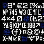
Vanity is an octic unicase typeface that captures the printed effect of letterforms on New Jersey license plates from the 1930s to the 1990s 🏎️🏁 Full case study here: order.design/otf/vanity


The typeface features a special set of roadway glyphs in addition to a standard arrow set. Learn more about the special features of Vanity at the case study: order.design/otf/vanity


Haltung is an upcoming release in development by Joe Moore. 🛠️
From the sans-serif lettering of Walter Käch to Frutigers Univers, to the students of the Basel school under Emil Ruder, Haltung is a typeface inspired by a common attitude and design sensibility. Stay tuned!


Stringer Dad Hat 🌻 Just in time for summer, our latest release “Stringer” is embroidered with black thread on a gold twill cap. Visit here to purchase: order.design/otf#otf_goods
Also available in Brooklyn @standardsmanual


order type foundry retweeted

Stringer 🗞️ is a bracketed slab-serif revived from Ionics of the early 20th century. Its namesake is a testament to the use of Ionics in newspapers, with “stringer” being a freelance journalist. Designed by @emklaebe. Full case study: order.design/otf/stringer


Introducing Stringer 📰 designed by @emklaebe
Stringer is a bracketed slab-serif revived from Ionics of the early 20th century and adapted for modern day typesetting. Its namesake is a testament to the use of Ionics in newspapers, with “stringer” being a freelance journalist🗞️


