

BI team lead and #dataviz enthusiast🥰 | x2 VOTD | Tableau, SQL, R and everything that I find interesting💫
Joined February 2013
- Tweets391
- Following376
- Followers361
- Likes446




Pinned Tweet
Finalized @tableaupublic dashboard template I’ve wanted to do for months!
It's a free-to-use, pre-built template with containers. Just copy all your charts to the template and easily put them on the dashboard💫
public.tableau.com/app/profi…
#datafam #tableau #dataviz #dashboard #bi

Anastasiya retweeted

Congratulations to the 2026 Tableau Community Leaders!
Ambassadors with the Tableau Community Leader designation contribute across the community. They evangelize Tableau, nurture growth, and amplify connection.
#TableauAmbassador

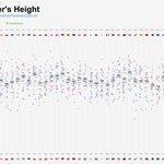
How tall are FIFA World Cup football players? ⚽
Norway, Bosnia and Herzegovina, and the Czech Republic top the list, both by average and median height, at around 187 cm (6’2”).
public.tableau.com/app/profi…
#fifa #dataviz #datafam #tableau


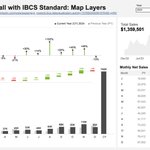
Waterfall with IBCS standard: me and @tableau , map layers and lots of lod calcs…
#dataviz #datafam #tableau
public.tableau.com/app/profi…

Last week my dream came true, and I had the opportunity to visit the F1 race in Baku 🏎
What a race!! Two of my favorite drivers were on the podium. And listening to the whole grandstand sing Smooth Operator — priceless ❤️
#datafam #tableau #dataviz #sportsvizsunday


Color borders for cleaner maps 💡
I found this lifehack years ago, and it's been my go-to move with maps ever since. Every time you create a map, try coloring the borders the same color as your background.
#tableauhack #tableau #dataviz #datafam

Anastasiya retweeted

Explore this #VizOfTheDay by Anastasiia Kuznetsova, using slope graphs to show start vs. finish positions in a global single-seater race. tabsoft.co/3HyZIyI

Boring Monaco? In this #dataviz, I look back at 20 years of the Monaco GP and analyze how often drivers finish in the same position they started.
public.tableau.com/app/profi…
#sportsvizsunday #datafam

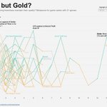
For this #makeovermonday I’ve tire to looks at the metascores for different game series. Game series groups were done manually so I really hope i didn’t make any big mistakes 🙈
#dataviz #datafam

#30DayChartChallenge – Log Scale
I wanted to create something similar to the famous scatterplot from Edward Tufte’s book Beautiful Evidence. For me, it’s the best showcase of the log scale.
Creating the images was the hardest part.

Stellar Scale: How Far, How Bright? 💫
A visual comparison of 174 visually brightest stars for hashtag#30DayChartChallenge - Stars

#30DayChartChallenge
It's never too late 😅 Trying to still particpate at the #30DayChartChallenge, today about fossils.
A histogram of dciovered dinosaurus body lengths

UTF and emojis in dashboard design
Wrote a bigger post in LinkedIn linkedin.com/posts/nastengra…
#dataviz #datafam #tableau #dashboards

Anastasiya retweeted

The #DataFamRisingStars 2025 are live! 90 standout Tableau innovators from 17 countries are shaping the future of #DataViz + #DataFam. Thanks to all nominators who keep this community thriving. 🔗adammico.medium.com/datafam-…

Anastasiya retweeted
See how @saddykinss visualizes help desk metrics in this #VizOfTheDay.
This business dashboard is an entry to the Community-led project Real World Fake Data #RWFD.
tabsoft.co/3Y8KiaK

Getting ready for the new #F1 Season. Just updated my viz with the full 2024 results. Can't wait!
public.tableau.com/app/profi…
#sportsvizsunday #dataviz


If you are not sure how to spend your New Year's Eve, here is my suggestion for a New Year reflections questionnaire 🎄

Anastasiya retweeted
That’s a viz wrap, DataFam! 🎉
A year of endless creativity on Tableau Public. Discover the most favorited visualizations and a curated collection of the data stories that shaped 2024: tabsoft.co/4gOHCoy
Last year, I created this #dataviz showing #formula1 drivers’ salaries and damage costs throughout the season. I just updated it with 2024 data!
Pierre Gasly set a record with zero damage costs this season!
Check it here: public.tableau.com/app/profi…
#sportsvizsunday
