

Fractional Designer for Growing Tech Companies / Focus: Deep tech, AI, Consumer Tech / Founder of Studio Contrast
Bucharest, Romania
Joined March 2023
- Tweets2.7K
- Following861
- Followers2.4K
- Likes1.3K




There are SO many epic designers not famous on X.
Most of the Behance OGs are not here. Most product builders and founders are not spending their days on X.
Don’t think the hype you see here is all there is.
1
4
357
Calin from Studio Contrast retweeted
A brand identity is good if it's a robust system, not cool posts on socials.
Last week I created a 3D app that lets the client's team build on-brand illustrations without an illustrator. Click and drag, position, export.
More coming soon!

Calin from Studio Contrast retweeted
The difference between good and great designers: the willingness to just sit down and learn how to do the thing you're designing for.
It's unglamorous and daunting, but absolutely critical.
Real example from the studio last week: before I design a technician workflow, I ask questions until I can do it myself.
This week, a setup flow for a hardware startup. Before drawing anything, I asked the engineer: What clicks into what? What's set up before the technician arrives? Where does each cable come from? What are the pass/fail criteria? Which variables does the user change? Can they skip this step?
The answers simplified it: power and most connections are set up in advance, normal mode needs no settings, options live in advanced mode, and skipping loads the default.
The role of a designer is to simplify.
You can't simplify a workflow you don't understand.

A brand identity is good if it's a robust system, not cool posts on socials.
Last week I created a 3D app that lets the client's team build on-brand illustrations without an illustrator. Click and drag, position, export.
More coming soon!
The difference between good and great designers: the willingness to just sit down and learn how to do the thing you're designing for.
It's unglamorous and daunting, but absolutely critical.
Real example from the studio last week: before I design a technician workflow, I ask questions until I can do it myself.
This week, a setup flow for a hardware startup. Before drawing anything, I asked the engineer: What clicks into what? What's set up before the technician arrives? Where does each cable come from? What are the pass/fail criteria? Which variables does the user change? Can they skip this step?
The answers simplified it: power and most connections are set up in advance, normal mode needs no settings, options live in advanced mode, and skipping loads the default.
The role of a designer is to simplify.
You can't simplify a workflow you don't understand.
Key rule for friction in UX: match it to the consequence.
Two products for the same hardware company.
1) A technician tool used many times a day:
No "Next" buttons, auto-advance when success is confirmed, no unnecessary confirmations.
2) A drone flight control app on a tablet:
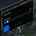
Slide-to-confirm for critical commands like Land, and photos open in place so you never leave the flight screen.
Undoable or already verified? Remove the friction.
Irreversible? Make it deliberate.
In the wrong place, friction is either annoying or dangerous.
When done right, it's a safety net.

4
189
The simple secret to making complex UI simple:
Default to an overview, then show detail on demand.
A couple of examples from recent work in the studio:
1/
A wiring diagram too small to read comfortably.
On a technician setup screen for a hardware startup, I recommended a panoramic zoom on hover: the box stays the same, the image snaps to 200–300%, you pan with the mouse, and it snaps back when you leave.
2/
Struggling to fit a plane seat map and a bunch of controls on a phone. Folding controls into a menu buys a few pixels. A maximize button buys the whole screen.
Takeaway:
Don't fight for pixels. Give the user a way in.
1
29
461
A rebrand isn't a break from your roots. It's a picture of what you're growing into.
Last week at the studio I was designing a new look for an app with a loyal user base for more than a decade. The client was worried long-time users wouldn't recognize the new look.
Pushback always comes with a loyal user base. When Instagram changed its logo, people lost their minds. Now it's stronger than ever.
So the we refined the look in such a way that key, recognisable brand identifiers stay the same and new ones grows around it.
The takeaway:
Keep what people love. Change what's holding you back.
1
3
199
You can’t vibe design well either if you’re not a designer.
I’m building a design system for a client now. Mid-fi design is done. Built fast and sloppy because we were focusing on UX, but it’s using auto layout, good structure, and the default iOS library styles.
I’m trying to get Claude to do the grunt work for me but I keep having to correct it, tweak it 100 times and build everything it misses. It’s only good for things with very clear instructions and some room for improvisation.
All this would be invisible to a non designer

2
17
710
“Design opening at a record low”
I’m busier than ever.
Design roles are low primarily because:
1) More companies work with contractors or small studios like mine
2) Roles get filled privately. Everyone has learned the hard way that opening a role publicly is going to flood your inbox with trash AI-generated resumes and messages.
3) Some companies are still in the “we might not need a designer anymore” phase where they’re accumulating design debt. The bill will come due and more roles will be reopened.

STATE OF THE TECH JOB MARKET IN 2026
Twice a year, I dig into trends in hiring and job openings. This is the fifth report I've done, and the most surprising yet:
1. PMs are winning in the AI era
2. Engineering demand has stalled
3. Design openings are at a record low
4. Every role now requires AI skills
5. Tech jobs are concentrating in the Bay Area
6. Remote roles are at a record low
7. The tech job market is growing fast, but mostly outside of software (gasp!)
Full report here: lennysnewsletter.com/p/state…

Let's face it – anyone can design an interface. It looks easy. "It's just buttons and text!"
The problem: most don't notice what they inadvertently break.
At a point I was working with someone on a client's team mocked up screen. It was fine. It had all the functionality, but... it felt off.
My notes were small: options hidden under a folding section the user had just "asked" to see (tapped an button), toggles and checkboxes used interchangeably, and less important features sitting above critical ones.
None of these break anything, but they add up. 100 of these small things and the product doesn't stick.
Investing in design is about getting that down to 0.

3
225
The design process isn’t an annoyance to be automated away with AI.
Great solutions come from the slowness and friction of dealing with evey detail: every interaction, every word, every use case.
An example from this week: a flight-tracking app where a switch confirms your default alerts are on. Then a user turns one alert off. The switch still says defaults are on. Not true anymore, and a switch only has two states. That’s the sort of detail AI misses.
AI builds from the average of everything out there. Mistakes like that are hard to spot if you just glance and say "looks good, do that."
Sometimes you need to slow down to move faster.
People assume user testing means asking users what they think of the design. Nope.
Ask for opinions and you get a comparison with the app they already know.
An app I'm designing for frequent flyers is about to go in front of users. My note to the team: focus on what they do, not on design critique. Every interview has to count.
Turn each open question into a task. Watch where they hesitate. Ask why after.
Users are great at showing you problems. Don't ask them to design the fix.
311
A brand that only works when its designer is in the room is a red flag.
Most brand projects end with a guidelines PDF. Then the team needs a new visual and no one can make it.
On a brand sprint for an AI startup, I'm building small apps with AI alongside the look: a key visual generator (drop in a photo, split it into a grid, an effect per cell) and a 3D illustration kit you arrange into scenes, no redrawing.
A deck that looks nice on paper isn't a handoff. It’s saying to the customer “You’re ok your own from now on.“ A brand is finished when the client’s team can use it to maintain brand consistency long term.
1
1
259
Pro tip on brand design strategy:
For every brand attribute, write what it means for your brand, and what it doesn't.
For example:
Reliable = evidence before claims / not bureaucratic or slow.
Bold = a clear position / not loud
Approachable = plain language / not unserious.
The "doesn't mean" column names the version of your brand you'd hate. The same brand persona can take very different shapes.
Think about the negatives as much as the positives. The strategy will become much sharper and execution much easier.
1
2
253
In a technical UI, color isn't decoration. It's a verdict.
Last week: calibration values shown in yellow, just to stand out. They were fine. Any technician would have read it as a warning.
Red, yellow, and green mean status in UI design. Nothing else.
A plain reading gets neutral text.
Need emphasis? Use size and position.
1
2
249
You don't need a redesign when the device gets smaller. You need a priority order.
A drone flight control app I'm restructuring: dense desktop-born UI, now on a tablet in the field. And a smaller device is on the roadmap.
So we design for both now. One clear hierarchy. On the smaller screen, low-priority elements move out of view.
Graceful degradation beats a major redesign.
1
1
241
What looks like an onboarding problem is usually a routing problem.
An app I'm structuring: users arrive for 5 different reasons. Onboarding asks which one, then routes every answer into the one action that predicts who sticks around, pre-filled.
Different doors. One room.
1
1
287
Most bad software was never touched by a designer.
AI made it even easier to ship poorly designed experiences.
As software gets more competitive, design becomes the only differentiator.
We're heading into a golden age of design.
Most technical startups pick a brand concept because it looks good (ascii graphics, glitch effects, classical paintings).
The strongest concepts come from how the product works.
1
2
316
An AI testing startup this month: agents fail a thousand times in a simulated copy of the business, safely. Like a flight simulator.
So the brand shows every scene twice: the real one, and its simulated double.
1
67