

Founder @ Stōkt | Awards Winning Creative Director
Montreal, Canada
Joined December 2023
- Tweets117
- Following385
- Followers334
- Likes1.6K





The Stōkt team is looking for an intermediate to advanced Framer developer to join us on a per-project contract basis.
We have a lot of development work in the pipeline and want someone who knows Framer well and is ready to push what’s possible with the platform. We’re looking for an individual developer, not an agency or a white-label team.
Here are a few of our latest projects to give you a feel for the sites we’re building:
partiful.com & rovebeyond.com
Interested? Drop your portfolio link in the comments. Please don’t email or DM. We’ll reach out if we think there’s a good fit.


We shipped two websites this week. They are both featured by Framer.
Feels good man 🙂↕️
rovebeyond.com & partiful.com

We shipped two websites this week. They are both featured by Framer.
Feels good man 🙂↕️
rovebeyond.com & partiful.com

Jay Nadeau retweeted

I honestly don't understand many new design tools. There are Pencil, Paper, Elyx, MagicPath, and many more launching each month. Great designers are behind them, and it feels like many people use them. But I feel so disconnected from their approach to design.
Let me share my thoughts.
They all have a middleman issue. What you design is not what you ship. We're in the age of AI. I want to see the exact behavior of my components, I want to see the exact "rendering"/"look" of my components. Why do I need a canvas that shows me just "designs"? We had that already in Figma for many years. Authors of those tools can argue with me, saying, "But we're much closer to the code than Figma. We use HTML/React or whatever to render your designs." Great, but it's not the same code anyway.
From that issue comes another one, a lack of a single source of truth. Design lives in two places again. Users see the one that is built in code, while designers look at their versions on the canvas.
Then you can tell me, "Come on, I'm a designer, not a developer. I need a canvas. Those apps give me a canvas." Do you know that you can ask AI to bring you a canvas into the actual project you're working on?
"But building code is slow, I need something simpler just to quickly iterate on my design ideas." Again, what's the problem with asking your Claude/Codex to solve that thing for you? AI can stop running tests/linters/performance checks, or simply make some drafts on that canvas for you in plain HTML/CSS, exactly like those tools do. But if you want to do something more complicated, nothing can stop you.
Which brings us to another point. Those are closed-source tools. I like to adapt my environment to my needs and my tasks. I don't want to wait anymore for companies to decide to prioritize or build something that's important to me, or support the AI client that someone uses (recent Figma drama). Software development has become cheap. Bringing any controls or canvases into your environment is not an issue if you need them.
I still use Figma, more like a sketchpad or for some brand work, but I don't understand why I would want to switch to something else if those tools fundamentally have the same problem as Figma.
For me, those tools still feel like they're made for designers who haven't figured out yet what AI is capable of. And I'm not talking about letting AI design instead of you. I'm talking about letting AI create the environment for you, which can be much more powerful and more efficient for the exact tasks that you or your team work on.
on.design/ is truly a game changer. The level of craft is absolutely insane.
Thanks @CharlesPattson for this!

I came out of a meeting with a potential new client yesterday.
They want a rebrand, but they don't want us to change their logo.
"It's fine," they said.
And honestly, to an untrained eye, it probably is.
But the designer and system builder in me was screaming inside.
The logo simply isn't scalable. Thin lines, highly illustrative, very asymmetric. None of these things are inherently bad, but in this case, they become a problem when you start thinking beyond the logo itself.
Because a brand doesn't live in a presentation.
It needs to work on a website. On a billboard. On a business card. On merch. In print. On signage. At 16px. At 16 feet.
So we're going to propose a full rebrand... 🙃
Even if that's not something they want, this is something they need.
Maybe the idea behind their current logo survives. Maybe parts of it carry forward. But the mark itself needs to be rethought and reshaped to become part of a system that can actually support a company of their size.
Agreeing with them just because they said the logo is "fine" would be a disservice to them.
And I think that's something we sometimes forget in client work.
Clients come to us for our knowledge and expertise. They usually have a good idea of what they want, but they don't necessarily know what they need to get there.
That's our job.
Not to blindly execute the brief, but to understand the goal, challenge the brief when necessary, and guide them toward the right solution.
You're the expert.
Stick to your guns.
🤖 Made with AI


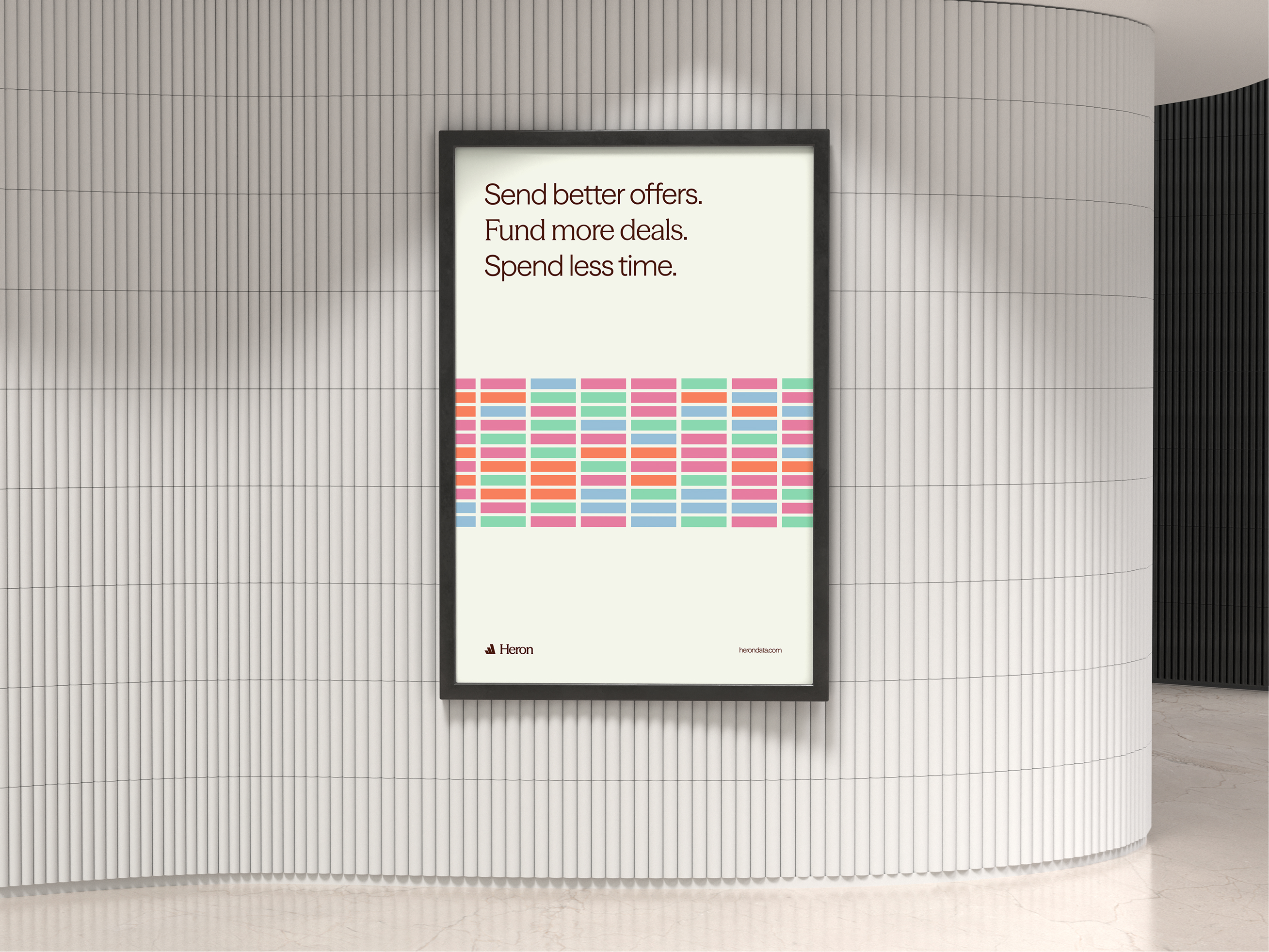
A couple of Posters / OOH including the Heron and the container concept.


Have you ever asked yourself how goods were shipped by boat before containers?
Before container shipping took off in the 1950s, moving goods was messy. Crates, barrels, bags of flour, all packed into a ship’s hold. Everything had to be loaded and unloaded individually, hoping it would survive the trip in one piece.
Then, in 1956, a man named Malcom McLean helped kick off a revolution in shipping.
The idea was simple: pack goods into large metal boxes that could move between ships, trains and trucks without having to unpack everything at every step.
Each container held its own contents. They could fit closely together, stack on top of each other and support the weight above them. Different goods, all moving through the same system.
A big metal box. Almost banal when you think about it.
But that simple idea went on to transform an entire industry and help shape the global economy as we know it today.
When the Heron project landed at Stōkt, this was the first connection I made.
What Heron is doing feels revolutionary in its own market. I wanted to find a subtle analogy that would tie the brand together and give it an identity of its own.
Heron is bringing standardization to the way data is handled in SMB finance and underwriting. They take messy information, organize it and make it easier to send, receive and use to make decisions.
Just like containers gave different goods a common way to move, Heron gives different kinds of information a common structure to work with.
That was the connection I wanted to build the brand around. They are building their own revolution.
This is why the new visual identity is based on one simple rectangular shape. Something that might remind you of… a container.
A shape that can stand on its own, repeat, stack and come together as part of a bigger system. The same thinking behind the product, translated into the brand.
Very simple. Almost banal. But with the potential to change everything around it.
This is the depth and thinking that goes into every brand we build at Stōkt. A lot of early thinking, mind maps and ideas come together before we even push a single pixel in design software.
If that’s the kind of thinking you’re looking for in your business, you know who to reach!
Sharing without the mockup 👀
One request from the founders before we started the web design phase:
“We should have a heron in the hero section.”
Did we succeed? 😏
Animation created with @figmaweave mixed with our own custom tool that we shipped with he Heron brand called "Colorful containers" built with toolcraft from @alex_barashkov


People sharing this post like “If you edit like that hit me up” are missing the point. Don’t get me wrong, edit is amazing, but let’s not forget about creative direction, concept, design, copywriting, voiceover, editing, sound design. This is probably not a one man job.

Jay Nadeau retweeted

Trump vs Mark Carney. Welcome to Canada 🇨🇦
Prompt in the commetns ⬇️
🤖 Made with AI