

Brand/Visual Designer. Illustrator. Available for projects. - Taller half of @spadenheart - IG: spadeandheart
Buy a shirt →
Joined December 2009
- Tweets9.6K
- Following406
- Followers740
- Likes9.1K






Bryan Flynn retweeted

Geoff has discovered the bagel-donut analogy I use in class. They’re both round and have holes in them. You usually eat them for breakfast. But they’re still different. Different is good. And important. I’m not eating a donut with lox. And I don’t want sprinkles on my bagel.

Anyone have any thoughts on Nevada's new logo? Remind you of anything, @ProfBenavidez?
(this is the university-wide logo unveiled. There's also an updated version of the Athletics-only side-facing wolf logo, too with NEVADA spelled out out over it).


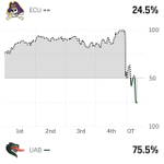
After last night, I hope to not see @ECUPiratesFB in the white script helmets for the remainder of this season.
Folks like to drag art majors, but 100% one of them would have TCB’d here.
P.S. Long time Rams fan here. Not alum, but I support local. It’s been a tough season. Here’s hoping those squiggles mark an inflection point with the program.

Same is true for brand/graphic design. Unsolicited work is often considered DOA/untouchable.
It’s frustrating, but it’s how it is. Before I post concept art, I reach out to see if there’s interest. After a no or no response, I share knowing it may get the black spot.

I still like Metro.
I still like red/white/blue and red/white/silver colorways.
I still want to further develop this concept one of these days.
xitter.cf/brydfly/status/1936784…

Many Washington Wizards fans want a franchise rebrand. They say a new era demands new primary uniforms, a new logo and perhaps a new name. What are the chances of all that happening? Story at @TheAthleticNBA, free for everyone to read:
nytimes.com/athletic/7677666…

"And if we win again ... it's called a 'winning streak.' ... It has happened before!" #PirateNation
Thinking of ENC today after the win yesterday, and hope are safe with today's weather.
Bryan Flynn retweeted

@teeslocalstore Is your business model to steal other people’s work and sell on your site? This literally has my name on it! Take it down!

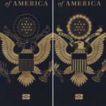
Follow-up on my passport post yesterday. The Seal is the Seal. The emblem is the same line art as the previous, just bigger. My crit is the new art spotlights the need for diff art when printing on dark surfaces. By inverting the feathers, the head now reads as dark.


The ring encircling the stars are white clouds. If there’s a desire to use filled areas (great) then that design choice has ripple effects. At minimum, the bald eagle should also be filled so it reads as light and connects w/ the body.
When/if a school can use their academic mark for athletics, or vice versa, it can really click. IMO this is not one of those times. This stacked UCF is a solid athletics mark, but in this rendered as-is iteration it's a really odd academic mark.


I’ve retyped my take b/c I want to be respectful but my words aren’t as diplomatic as I’d like, but here goes:
1. Reversed graphics can be tricky, but there are solves available.
2. Bald eagle head is white. Non-negotiable. Should be gold here. Full stop.


1. Spear only helmet.
2. Primary logo could be a W-spear lockup. Football container shape is a natural fit.
3. Redraw the stencil so it’s not as clunky.
4. Or revisit the “crest” for the primary. Football + DC flag + crossed spears.


1. Happy the team has finally arrived at it. Feels like some of us have been on this bench for years.
2. I do hope they’ll revisit the W itself. The stencil could be improved.


EXCLUSIVE: Sources tell me the Washington Commanders are planning to change their primary logo for the 2027 season
And that logo is a familiar one: the team’s new alternate W logo with a spear running through it, unveiled in April with their new black “Hail Raiser” uniform
I’m also told there are no plans for further changes to Washington’s branding in 2027 *as of now*
Here’s more + why I think the switch is a smart move👇

.@the_jerseynerds / #JNConceptober26 / Day 1: NHL
Digging back thru the archive to join in for a couple of days. Re-upping my Utah (Don't Call it) Yeti concept original logos and jerseys (based on a striping/shoulder template Boston has used) before starting to draw mammoths.

If my schedule permitted, I've revisit my riff on my Bobcat (xitter.cf/brydfly/status/1999501…) where I changed the fur words to "National Champs" and render it in liquid gold.


