

conversion-focused websites. tripled a store's sales in 6 weeks. $2.2k for another client in 9 days. case studies below.
Germany
Joined March 2024
- Tweets21.5K
- Following315
- Followers627
- Likes34.9K


Pinned Tweet
From €1.8K/month to €5.5K/month - Here’s how I fixed an E-Commerce stores website:
Refined Berlin had everything in place for success.
- A strong brand.
- Great products.
- Consistent traffic.
But their website was failing to convert visitors into buyers.
Their conversion rate sat at a brutal 0.04%.
Sales barely hit €1,800/month.
They weren’t struggling because of bad products.
They were struggling because their website made buying too hard.
It was hard to navigate. No clear path to purchase. Too many friction points.
Customers landed on the site, got confused, and left without spending a single cent.
So I tore it down and rebuilt it from the ground up.
Instead of just making the site "look better", I redesigned it to actually sell:
- Simplified navigation so customers could find what they wanted fast
- Psychology-driven layout that guided visitors toward checkout
- Frustration-free buying process that made purchasing feel effortless
The result?
- Sales skyrocketed from €1.8K/month to over €5K (and the month isn’t over yet)
- Conversion rate jumped from 0.04% to over 1.05%
- Returning customer rate climbed to 8.22%
Refined Berlin didn’t need more traffic.
They needed a website that actually converted the traffic they already had.
Now, instead of bleeding potential buyers, their website is making them money 24/7.
If your site isn’t converting, you’re losing sales every single day.
Fix that.


the "ai built my website in ten minutes so i dont need a designer" crowd is shipping a clone of their competitors homepage and calling it a win
i build with ai every day and my last generated coaching page still needed nearly forty fixes before i would send it
ai multiplies the taste of whoever is typing so if you cant design without it you cant design with it
the ai builder hands the plumber and the dentist the same fucking layout because it learned from the websites they all copied
here is where it falls apart every time
1) it reaches for the same moves
frosted glass cards and a serif headline and an icon over every box show up on all of them
visitors have seen that homepage so often their gut gives it zero reaction
2) it stacks boxes where the story should go
it groups features into bullet grids and leaves the visitor to connect them
a person who designs orders sections so each one answers the question the last one raised and the visitor keeps scrolling for the next answer
3) it fakes proof without blinking
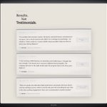
that same coaching page came with a "show more" button under the testimonials that only pretended more existed
a visitor who clicks it and finds nothing new decides the rest of the page lies too
Ben Winzer retweeted
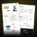
built this landing page for a strength and conditioning coach

ALT website design by @b_winzer
there are only 3 volume levels on a homepage and most owners crank every single element to the loudest one
their logic is that everything on the page matters so everything should stand out
which leaves the visitor with five things screaming at once
because the eye goes wherever size and contrast and color pull it first and when everything pulls equally it bounces around and lands on the back button
the cheap agency template does exactly this shit with a giant headline a giant subhead and a giant button in the same bold font all fighting for one spot
here is the order that actually works
#1 one loud thing
usually the headline because it decides whether anyone keeps reading
a stranger with 14 followers commented on a website i rebuilt this week that the heading grabbed his attention immediately and that is what a single loud element does to someone scrolling fast
#2 the supporting tier
the subhead and the proof and the button live here and the button gets the one accent color on the page so the eye finds it second
#3 the quiet details
footer links and fine print and small labels go smaller and lighter so they wait for whoever goes looking
squint at your homepage until it blurs and whatever you still see is what you told people matters
your website started dying the day it launched and owners still treat launch day as the day the work ended
that belief bleeds visitors every single week
i see the same path over and over
first it went live light and fast because whoever built it compressed every image
second the owner uploaded photos straight off the camera roll at a few megabytes each and the homepage started crawling on mobile data
third a chat widget and a popup plugin and a cookie banner showed up and the text began jumping right as people reached for the button so they tapped the wrong thing
fourth a page got renamed and every old link in google and in old emails started landing on a 404
the visitor who hits that 404 closes the tab without telling anyone and google logs that shit against your ranking
this week i moved every website i built onto my own domain and the first thing i locked down was that every link i had already sent still landed on the right page
one prospect clicking an old link and hitting an error page would have read the whole thing as dead
and the nephew who built yours over a weekend handed over the login and vanished so nobody has clicked your footer links since
a website is a shop floor and somebody has to sweep it
- convert every photo to webp before it goes up
- click every menu and footer link once a month
- redirect any url you rename to the page that replaced it
your clever homepage tagline is costing you visitors and i watched it happen on almost every website i rebuilt this week
the owners all believed a cute line makes people remember them
and that line is exactly what sends people back to google
because a stranger gives your first screen a few seconds to work out who you are and what you sell and what to click
and "elevate your journey" tells them fuck all
the template every plumber in the city uses opens with "your satisfaction is our mission" over a stock guy holding a wrench and then the owner wonders why the phone goes quiet
so the answer goes in the first screen and the clever line goes somewhere below it
a coach
name the exact person you coach and what changes for them with the apply button right underneath
an agency
the service and the kind of client belong in the headline before any showreel starts autoplaying
a local plumber
lead with the city and "emergency repairs" because that guy is reading with water on his kitchen floor
a dentist
show the neighborhood and the next open appointment above any photo of a family grinning at the camera
a webinar company
spell out what the webinars sell for the client and park "book a call" where the thumb already sits
there is only 1 thing a visitor checks in those first seconds
AM I IN THE RIGHT PLACE
conspiracy theory but the back of your head has its own sensor for strangers and it only shuts up once your eyes report back
i sat in a three hour lecture tonight with a row of people behind me that i hadnt looked at yet
the whole first half my attention kept sliding to the back of my neck and every whisper and laugh behind me got filed as being about me even though it obviously wasnt
then in the break i turned around and finally saw who was sitting there
and the second half was completely calm with the exact same people whispering the exact same amount
the only thing that changed in that room was that my eyes had sent the faces over to whatever part of me was running the scan
so i believe the back of your head treats an unseen face as a threat by default and keeps a slice of your attention locked on it until it gets real data
which would also explain why the back row of every lecture hall fills up first because sitting there means the sensor has nothing behind it to watch
and the same scan is what makes a stranger standing behind you in a line fucking unbearable until you glance back once
my brain has a second operator that runs my body for a few seconds every morning
today it turned my alarm fully off while the real me was sure i hit snooze
i woke up at 8:32 with zero memory of that choice

a few days ago two leads of a group i just joined asked me what i expected from them
i gave them the default answer about good communication and then they went deeper and asked how i expected the tasks and the whole thing to go
and i told them straight up that i had zero expectations for that
they looked at me like i said something weird but it was the most honest answer i could give
an expectation is a standard you hold for how someone else will act and you can only build that standard out of something you already lived through
i had never been in that team or anything close to it so my brain had nothing to measure them against
same thing happened the first time i sat in front of a new lecturer this semester
i walked in with zero opinion on how he would structure his slides or deliver anything
he turned out to be boring as shit and i only knew that after the fact
and that first lecture is exactly what gave the second one a bar to clear because now i had something real to compare it to
people who invent expectations for stuff they never touched end up mad at reality for failing a rule they made up in their head
walking in blank and letting the first round write the rule is so underrated btw
strip every animation off your homepage tonight because the scroll effects you paid extra for are covering up a layout that never worked
i ran a presentation out loud today with the slides off and every weak transition showed up the second there was nothing on screen to hide behind
a talk that only holds up while slides fly in is a weak talk
your website runs on the exact same rule
the first scan a visitor does reads the layout and the fonts and the photos and the order of your sections and decides from that whether to stay
animation shows up after that decision so all it can do is multiply what is already there
which means a fade in on a section with three fonts fighting each other just makes the visitor wait longer to see the fight
the agency that sells floating 3d blobs and parallax to a roofer is selling a light show to a guy whose phone number sits a mile of scrolling down
if it looks like shit standing still it looks like shit moving
on my own website today the sections got reordered for the phone and the fonts an ai tool picked got swapped for plain ones before the main button got its subtle glow
the glow went LAST because a glowing button inside a broken layout just shines a light on the mess
writing "we deliver results that exceed expectations" on your homepage is the weakest sentence a business can publish
it comes down to self talk vs outside proof
a stranger on your homepage has zero experience with you so the only thing they can measure you against is what somebody else reports
and buyers question everything now so they skip your adjectives and go hunting for a human who said something checkable
which is why the testimonial slider every cheap agency ships with five stars and "jm" under the quote does fuck all
the visitor sees initials and assumes you typed it yourself on a tuesday night
claim + real name + specific detail = proof
bad
"amazing service highly recommend"
good
"the bathroom was finished on friday like he promised and he sent a photo after every step" with the full name and face of the client right next to it
same happy client and one version gets read while the other gets scrolled past
the strongest version of all lives on a review platform you cannot edit because the visitor knows you had zero hand in it
so pull your best reviews from that platform straight onto the homepage with the full names left on

Ben Winzer retweeted
landing page i built for a health coach for men over 40

ALT website design by @b_winzer
hiring a designer for their "good eye" is the most expensive decision you can make for your homepage
because an eye picks every gap on the fly and two sections almost never come out the same
your visitor reads spacing with their eyes long before their brain has a word for it
when the gap under one headline is wide and the gap under the next one is tight the eye has to recalibrate at every section and the brain logs all of that as noise before anyone can name what is wrong
and that visitor spends every evening inside streaming and music apps where a whole team tuned every pixel so that is the bar your homepage gets compared to whether you like it or not
i caught a single gap on my own website on my phone today that sat a few pixels off from the rest and it bugged me before i could even say why
that same reaction fires in every stranger who lands on your homepage and the nephew who eyeballed yours over a weekend left dozens of those gaps in it
so the fix is a rule the designer follows on every single section
THE RULE:
1. pick one small gap for things that belong together like a headline and its subheader
2. groups like two cards side by side get a bigger gap
3. every section sits the same large distance from the next and that distance NEVER changes
4. font gets three or four sizes and every line on the website uses one of them