





Pinned Tweet
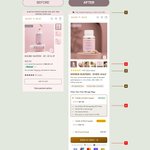
Thursday audit: the biggest change on Burst Creatine Gummies wasn’t visual polish. It was changing the job of the page.
Before: a product page.
After: a routine decision path.
The optimized flow does four things earlier:
1. Names the friction: “Real Creatine. No scoop required.”
2. Moves proof closer to doubt: testing, transparency, reviews, and the 30-day guarantee.
3. Makes the offer explain itself: pouches, servings, savings, shipping, and subscription value in one place.
4. Shows the daily habit, not only the SKU.
The strongest transformation is the sequence:
friction → proof → routine → offer
That gives the click a clearer reason to continue and gives the buyer less work after the click.
I’m validating the hypothesis against CTR, landing-page CVR, subscription starts, and renewals. No invented lift. The design is the hypothesis. The numbers are the verdict.
What is the first friction your product page should remove?
#DTC #Shopify #CRO

Adebiyi Samuel | DTC Conversion Designer retweeted
The hardest part of building a peptide brand is not finding a vial supplier.
It is making sure the business can legally sell, clearly explain, and profitably deliver what it promises.
Before building the site, I would run 3 checks:
1. Claims and compliance.
Can you explain the product without drifting into unapproved treatment claims?
"Recovery,” “glow,” “inflammation control,” and “regeneration” are not harmless words.
Your claims determine your ad angles, landing-page copy, payment risk, and customer expectations.
Get the compliance lane clear before designing the funnel.
2. Product clarity
Can a first-time buyer understand:
- What this product is
- Who it is for
- How it differs from the other vials
- What the protocol means
- What they are actually buying
A grid of “best sellers” with similar bottles creates choice friction.
“Grab your own protocol” sounds interesting.
It does not answer the buyer’s next question.
The page should guide the decision without pretending to prescribe.
3. Unit economics and trust
Before celebrating a $21.60 order, model:
- Product and testing costs
- Fulfilment and cold-chain requirements
- Payment processing
- Refunds and chargebacks
- Discounts
- Customer support
- Repeat purchase rate
Then build the offer around contribution margin.
A 20% discount, money-back guarantee, and low first order may improve conversion while making the customer unprofitable.
The brand is not ready when the homepage looks premium.
It is ready when the claims are defensible, the choice is understandable, and the economics survive after the first purchase.
Adebiyi Samuel | DTC Conversion Designer retweeted
Most PDP redesigns obsess over the hero image.
That is rarely where the biggest conversion lift comes from.
On this page, the important changes were the decisions below the product image:
1. Shipping clarity above the fold
“Free shipping over $150” reduces a checkout surprise before it becomes an objection.
2. Product image that shows the product in use
Not just a bottle on a flat background. The new image makes the product easier to understand at a glance.
3. Reviews moved into the decision zone
The rating and review count now appear before the buyer has to hunt for proof.
4. The product now explains itself
The description answers what it is, how it works, and why the buyer should care.
5. The offer is easier to compare
One bottle, two bottles, subscription, savings, free storage bags, and cancellation terms are visible in one place.
6. The CTA now carries a reason to click
“Boost My Supply” is stronger than a generic “Add to Cart” because it connects the action to the buyer’s goal.
7. Trust is placed beside the decision
Fast shipping, secure checkout, local sourcing, and payment options reduce the final hesitation.
The expected conversion lift?
We cannot honestly get that from a screenshot.
The correct hypothesis is:
- Better proof should reduce uncertainty.
- Better offer framing should improve bundle and subscription selection.
- Clearer shipping should reduce checkout friction.
- Stronger order economics should improve profit, not just conversion rate.
I would measure:
Conversion rate
AOV
Subscription take rate
Profit per visitor
Checkout completion rate
Next tests:
- Default the 2-bottle option versus the 1-bottle option
- Test “Save $32” against the current value framing
- Add a sticky mobile CTA
- Test review photos directly beside the offer
- Test a post-add-to-cart upsell without discounting the first order
The goal is not simply more buyers.
It is more profitable decisions from the same traffic.
Check these designs out to improve your CVR, if your LPs are struggling to convert per visitor.
Updating per week.
figma.com/design/J7Y2rU8…
Adebiyi Samuel | DTC Conversion Designer retweeted
Ignorance is not a stigma, we're all ignorant in something at every point in our lives.
So as we begin this week.... Reset, Refocus and Reframe your goals.
And never.. (at whatever level you find yourself atm).. stop learning.
Good morning ❤️

Ignorance is not a stigma, we're all ignorant in something at every point in our lives.
So as we begin this week.... Reset, Refocus and Reframe your goals.
And never.. (at whatever level you find yourself atm).. stop learning.
Good morning ❤️


Adebiyi Samuel | DTC Conversion Designer retweeted
You are trying to sell a piece of bathroom hardware.
Your customer is just trying to figure out why their $300 skincare routine is failing.
Sending cold Meta traffic straight to a showerhead PDP forces a mechanical decision and spikes your CAC.
Here is how we use a "Step Zero" advertorial bridge to drop CPA and build a 90-day retention engine:
• The Blame Shift:
We don't pitch a product.
We pitch the failure of their current routine.
We educate them on how heavy metals strip the lipid barrier so the shower water takes the blame, not their serums.
• Frictionless Execution:
Hardware scares buyers. We kill the "I need a plumber" objection instantly.
4 steps, an included tiny wrench, and a sub-100-second install time.
• Clinical Proof Over Fluff:
We anchor the page in hard data, not aesthetic vibes:
65% saw skin pH normalize, and 81% experienced less hair shedding in 4 weeks.
• The Continuity Trap:
It’s a recurring subscription disguised as a bathroom fixture.
The KDF-55 filtration requires a 90-day replacement, locking the customer into a 4x/year LTV cycle with zero extra ad spend.
The product is already selling, we just needed a new angle to acquire new personas.
Here's how it done!
Adebiyi Samuel | DTC Conversion Designer retweeted
Your product image carousel is the most valuable real estate on your Shopify store.
If it only shows beautiful packaging, you are leaking conversions.
Cold Meta traffic has a 3-second patience window. They need visual proof that your product actually works before they even read your copy.
Here is why optimizing the image stack for an Italian brand like Torino 21 builds immediate trust and secures the Day-1 margin:
• Social Proof Proximity:
We embed the 5,000+ buyers stat directly into the carousel. Skeptical cold traffic won't scroll to the footer to find reviews. We validate the click instantly.
• The "Us vs. Them" Matrix:
We use visual contrast to show 9-hour wear against generic alternatives. This justifies the premium price point and kills price anxiety.
• Visual Risk Reversal:
The 30-day guarantee is stamped right on the bottle. It removes purchasing friction at the exact point of visual contact.
Gorgeous packaging builds brand loyalty after the purchase.
Direct response visual architecture acquires the customer.
A lot of DTC health copywriting is either dangerously non-compliant or boringly weak.
You don't need to risk an FDA warning letter to hold a profitable ROAS on cold traffic.
You just have to stop selling the disease and start selling the destination..
❌ "Cures chronic bloating" = Account banned.
✅ "Promotes a calm, balanced gut so you can enjoy meals without the aftermath."
❌ "Reduces arthritis pain." = Restricted claim..
✅ "Helps maintain healthy joint mobility for an active, friction-free lifestyle."
Sell the structure and function.
The FTC leaves you alone, and the customer still buys the outcome.

Adebiyi Samuel | DTC Conversion Designer retweeted
The revenue dashboard can tell you a lie without showing a single wrong number.
A PDP test lifts conversion rate from 4% to 6%.
Looks like a win.
But if contribution profit per order falls from $30 to $15 because of heavier discounting:
Before:
4% × $30 = $1.20 PPV
After:
6% × $15 = $0.90 PPV
You increased conversions by 50%.
You reduced profit per visitor by 25%.
That is the revenue mirage.
The purchase happened.
The business got poorer.
Track Profit Per Visitor:
PPV = Conversion Rate × Contribution Profit Per Order
Build the order-level profit number consistently.
Include COGS, fulfilment, payment fees, discounts, returns, and paid traffic where relevant.
Then judge the test.
Not by how many more people clicked “buy.”
By how much profitable contribution each visitor created.
A higher conversion rate is only a win when the extra orders improve the economics.