
Head of CRO @kandyforscale Multiple 9 figures in D2C ecom. Dad. Behavioural Science nerd.
Joined May 2026
- Tweets40
- Following67
- Followers26
- Likes59




I always find this one interesting psychologically, because on the face of it, it shouldn't really make a difference.
Most stores take most, if not all, major cards, and consumers know this already. So unless the store supports more obscure methods, it seems an unnecessary use of real estate.
Yet I agree. It is a must have, because time after time, the test data shows it.

Add payment method icons directly below the CTA in the cart.
It sounds almost too small to matter, but the placement is what makes it powerful.
The cart is the point where the customer stops evaluating the product and starts evaluating the purchase itself.
Now different questions enter their head:
Can I use PayPal?
Do they take Amex?
Can I use Klarna?
Will Apple Pay work?
Is this checkout secure?
Am I about to waste time going through checkout just to find out they don’t support my preferred payment method?
If you answer those questions before the customer clicks “Checkout,” you remove a layer of uncertainty at the exact point where hesitation becomes expensive.
The icons also work as a familiarity signal.
People recognize Visa, Mastercard, PayPal, Klarna, Apple Pay, etc. instantly. They’ve seen those logos thousands of times across stores they already trust.
So instead of the cart feeling like a transition into an unknown checkout flow, it feels more predictable:
“Yes, I know how I can pay here.”
That matters even more on mobile, where people are usually moving faster and are less willing to dig around for information.
It’s not really about making the cart “look more trustworthy.”
It’s about reducing payment uncertainty, increasing checkout predictability, and answering a purchase-critical question before the user has to ask it.
Tiny implementation.
Almost no additional friction.
And it’s one of those tests that has consistently produced positive ROI for us.

Spent the morning at Ecom Insiders. Was nice to meet some really nice people in the ecom space, which sometimes can feel like a rarity!

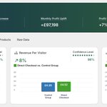
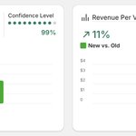
We tested an oldie (but often a goldie) - skipping the cart and taking the user straight to checkout when they hit add to cart.
After a full cycle, Conversion Rate and Revenue per visitor both moved up. Average order value stayed flat, as expected.
Why this works is pretty straightforward.
The cart is another chance to second guess the purchase. "Do I really need this?" "Do I really want to spend this money?" "Is this actually the right product for me?"
Take them straight to checkout and you skip that opportunity for hesitation.
Doesn't work for every brand. I tested this on a mens cosmetics brand that was already converting really well, and going direct to checkout properly hurt CVR and RPV.
So it needs to be tested. Don't just assume the cart is friction and kill it.

Tested across 30+ brands and my findings don't quite echo the same
I found it largely depends on AOV, and there's a middle ground
Low AOV stores (< $50) shipping feels painful & CVR drops unless the shipping price is sub $3
$50 - $100 AOV stores, reasonable shipping costs are accepted
> $100 AOV stores, shipping price becomes painful again especially in the "Affordable Luxury" space
Oh man, I really love CRO.
Such a good feeling when research, education, hypothesis and sometimes, even just a gut feeling come together and result in HUGE wins for clients.
I found the cheat code to growing followers on LinkedIn.
Just put out a post saying you're hiring. My inbox is on fire.
p.s I'm looking for a Junior CRO to join the CRO team @kandyforscale - drop me a DM if you think you would be a good fit.
Me: We must run all tests for at least one full cycle!
Also Me: Squeals like an overexcited schoolgirl when a test has run for 20 minutes. It's 9 orders, Dan. Chill!

We moved the product title, price and introduction above the image gallery.
The hypothesis? If we move the variant selector as close to the gallery as possible, CVR and RPV will increase as customers can more easily make a decision about their product selection.
The page now runs title, price, intro, gallery, with the colour swatches sitting directly underneath. When they tap a colour, the images immediately above it change to match.
Conversion improved. As did Revenue per visitor.
I've run this across several brands now and it tends to be a performer, so it's one I keep going back to.
The reason, for me, comes down to what someone is actually doing when they tap a colour swatch; they're checking their choice is the right one.
On a psychological level, picking a colour is a decision nobody can complete without seeing the result, so every tap opens a loop that stays open until the image confirms it, and if confirming it means scrolling back up the page, you've introduced friction to the one decision the customer is trying to make.
On mobile (where it matters most) that gap is amplified. The gallery and the swatches might sit a few thumb scrolls apart, repeated for every colour they want to see. Heatmap data showed most people won't do that more than twice.
If you sell on colour, or your product has bundle offers, check how far your customer has to travel to see the thing they just picked.

We added the price directly beneath the product title for this brand. Not exactly a groundbraking move, but...
before the test, the price only appeared inside the product selection boxes.
In theory, there was nothing outrageously wrong with that. The price was on the page and every option was clearly priced.
But nothing sat under the title. So after reading the product name, the customer still had nothing telling them what this was going to cost, until they scrolled down to see the product selectors.
We changed that. One price, directly beneath the title, updating dynamically as the customer switched variant.
Conversion improved. Revenue per visitor and profit per visitor went up with it. Average order value held steady, which was expected since this test did nothing to nudge people to larger baskets.
A simple change that worked because of two things;
We introduced clarity. Pricing became as clear as it could possibly be. Nobody had to scroll, or select a variant, or work anything out before they knew roughly where they stood.
Even when the number they saw was higher than they might have hoped, they at least had a baseline.
Psychologically, an unknown price is an unanswered question that makes people feel uneasy, and that feeling is enough to lose many customers.
The second thing, for me, is more interesting.
The price we showed by default was the most expensive variant on a per-unit basis. So the moment someone selected a multiple offer, the per-unit price dropped.
That first number acted as an anchor. Meaning every other option then appeared as a saving against it, which of course made the deal a lot more enticing than it would have looked on its own.
That notably doesn't work for every type of product; If your product only has one variant then there's nothing to anchor to other than a compare-at price, but you get the idea here.

We put a shipping protection widget in the cart drawer for this brand. Not a new idea. But we'd already tried it at checkout and it went nowhere.
The first version sat right under the shipping address form. Almost nobody took it. It was so flat we considered dropping it completely.
Then we moved it to the cart drawer. Same offer, same price, same customers.
Conversion improved. Revenue per visitor went up.
It's worth noting at this point that this is a real genuine service, not a scam, and the box is unchecked by default. Nobody gets opted in and left to spot it later. Every customer who took it went out of their way to add it.
So why did placement matter this much?
Because of what the customer is doing at each point. By the time someone is filling in their shipping address, they're out of shopping mode. They're working through fields.
They want to be done.
An optional extra there doesn't really land as an offer. It lands as another step. Or perhaps worse, as a cost turning up while they're still making that final decision.
In the cart drawer, they're still building the order. Adding things is the entire point of that screen. There's no final total yet, so a small line item doesn't feel like it's inflating anything.
The price of course does a lot of the work too. It has to sit low enough against your AOV that it never becomes a decision. The moment someone stops to consider it, you've lost. It should feel like a no-brainer, not a purchase.
This won't work everywhere.
Maybe your AOV is too low for it to make sense. Or your product doesn't carry any genuine delivery anxiety. Or you send people from PDP straight to checkout and the cart drawer is bypassed completely.
But if you've tested an add-on and decided your customers don't want it, check where you asked before writing it off.
