

Find, try, and buy fonts with ease.
- Tweets46
- Following40
- Followers14
- Likes71
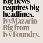


ALT A type specimen for IvyMazarin Big from Ivy Foundry.

ALT A type specimen for IvyMazarin Big from Ivy Foundry.

ALT A type specimen for IvyMazarin Big from Ivy Foundry.

ALT A type specimen for IvyMazarin Big from Ivy Foundry.


ALT Screenshot of the new American Type Founders website at atftype.com, showing type specimens, font family pages, and company history from the ATF® Collection.

ALT Screenshot of the new American Type Founders website at atftype.com, showing type specimens, font family pages, and company history from the ATF® Collection.

ALT Screenshot of the new American Type Founders website at atftype.com, showing type specimens, font family pages, and company history from the ATF® Collection.

ALT Screenshot of the new American Type Founders website at atftype.com, showing type specimens, font family pages, and company history from the ATF® Collection.
ALT Screenshot of the new American Type Founders website at atftype.com, showing type specimens, font family pages, and company history from the ATF® Collection.
ALT Screenshot of the new American Type Founders website at atftype.com, showing type specimens, font family pages, and company history from the ATF® Collection.
ALT Screenshot of the new American Type Founders website at atftype.com, showing type specimens, font family pages, and company history from the ATF® Collection.
ALT Screenshot of the new American Type Founders website at atftype.com, showing type specimens, font family pages, and company history from the ATF® Collection.
ALT A type specimen for IvyMazarin Big from Ivy Foundry.
ALT A type specimen for IvyMazarin Big from Ivy Foundry.
ALT A type specimen for IvyMazarin Big from Ivy Foundry.
ALT A type specimen for IvyMazarin Big from Ivy Foundry.


ALT Font specimens demonstrating the use of Kellarie, the newest script font family from Laura Worthington Design.

ALT Font specimens demonstrating the use of Kellarie, the newest script font family from Laura Worthington Design.

ALT Font specimens demonstrating the use of Kellarie, the newest script font family from Laura Worthington Design.

ALT Font specimens demonstrating the use of Kellarie, the newest script font family from Laura Worthington Design.

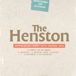
ALT Images showing the font family The Henston in use. Designed by Elena Genova for My Creative Land, a TTF foundry.

ALT Images showing the font family The Henston in use. Designed by Elena Genova for My Creative Land, a TTF foundry.

ALT Images showing the font family The Henston in use. Designed by Elena Genova for My Creative Land, a TTF foundry.

ALT Images showing the font family The Henston in use. Designed by Elena Genova for My Creative Land, a TTF foundry.


ALT Partiche used in an example of a poster or program for Grieg’s “Holberg Suite,” pairing large headlines with smaller text in a muted teal.

ALT Partiche type specimen: a fictional poster for Dante’s “Divine Comedy,” with the title set in black and stacked in tall caps over a blue-green gradient.

ALT Partiche type specimen. An example of a recipe found in a book or magazine for “Italian Pasta al Pomodoro,” showing the title alongside the ingredient list and body text.

ALT Partiche in use in a cover image with a “5 Fonts” badge and the Lipton Letter Design logo beside the wordmark “Partiche” set large.
ALT Partiche used in an example of a poster or program for Grieg’s “Holberg Suite,” pairing large headlines with smaller text in a muted teal.
ALT Partiche type specimen: a fictional poster for Dante’s “Divine Comedy,” with the title set in black and stacked in tall caps over a blue-green gradient.
ALT Partiche type specimen. An example of a recipe found in a book or magazine for “Italian Pasta al Pomodoro,” showing the title alongside the ingredient list and body text.
ALT Partiche in use in a cover image with a “5 Fonts” badge and the Lipton Letter Design logo beside the wordmark “Partiche” set large.


