

We design how digital products are experienced, understood, and chosen. SaaS - FinTech - Blockchain - Beauty & Wellness - Mobility - Renewable Energy
Barcelona, Spain
Joined August 2012
- Tweets471
- Following121
- Followers637
- Likes39




The pricing page is the second homepage.
Most teams design it like a spreadsheet.
More deals are decided on /pricing than anywhere else on your site. The energy you put into the hero should be doubled on the price grid.
dtailstudio.com/blog/pricing…
#SaaS #PricingStrategy

Feature parity theatre is the worst offender. If every plan checks every box, you don't have tiers, you have one product with three prices.
The buyer notices.
@aprildunford 's 'Obviously Awesome' (2019) is still the best book on this. Pricing pages without a positioning claim at the top are just price lists.
Most SaaS products feel slightly worse with every release.
The best ones feel simpler as they grow.
The rule that makes it possible: every release that adds something has to identify something to remove or hide.
dtailstudio.com/blog/best-sa…

Most of what teams ship as features are actually discoverability problems for features that already exist. We unpacked the diagnostic here:
dtailstudio.com/blog/more-fe…
Designing SaaS product pages is not about showing everything.
It’s about helping users understand what matters.
This case study explores how we approach clarity in complex products.
Where do you see most product pages fail today?
Full project ↓
dribbble.com/shots/27232406-…

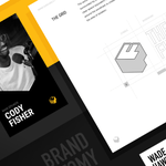
ALT SaaS case study page UI design showing structured layout, clear hierarchy, and product-focused UX for complex digital platforms.
Most products are built for experts.
But growth comes from everyone else.
Too much jargon
Unclear actions
High perceived risk
→ friction everywhere
If users don’t understand it, they won’t use it.
Adoption starts with clarity.
Not technology.
We design how complex products become clear, usable, and adopted.
→ Follow @dtailstudio for insights on product, UX & decision design.
Teams building complex products:
What’s harder right now? – at Barcelona, Spain
0%Explaining the product
0%Reducing complexity
0%Driving adoption
0 votes • Final results