

A global type design studio at the vanguard of contemporary typeface culture & design Listening to Sharp FM Sharp Type Season 2 is now live
New York, USA
Joined July 2015
- Tweets1.4K
- Following188
- Followers6.1K
- Likes16.3K





Pinned Tweet
NEW RELEASE: ♦️🔷🔸 Introducing Rotina 🔸🔷♦️
Rotina is a sturdy modernist sans with a playful secret. Built on the solid foundation of a novel and clean utilitarian neo-grotesque, Rotina is an aesthetically cohesive Swiss army knife of tools that brings workhorse fundamentals, robust utility, and a heavy dose of aura to your daily design routine.
Designed by: @ErikMarinovich
Explore Rotina: shrptyp.co/Rotina
Sharp Type retweeted

Arny and Arny Sans, out now. Full trials & student discounts available on my all-new website.


Sharp Type retweeted

sharptype.co/typefaces/redwa…
4 the ppl


Sharp Type retweeted

feels like slab serifs have fallen out of vogue but they're so back with @SharpTypeCo's latest


Major update to our future-forward hauntological sans: the Ghost Superfamily is now a 4 axis variable designspace with Display-Text, Mono-SemiMono-std (with the weight and slant also ofc)
sharptype.co/typefaces/ghost…
sharptype.co/typefaces/ghost…
sharptype.co/typefaces/ghost…
sharptype.co/typefaces/ghost…
sharptype.co/typefaces/ghost…
sharptype.co/typefaces/ghost…


Sharp Type retweeted

Svět knihy 2026 gets a new visual language. In an unexpected twist, the main character is a book. Muahahaha!
I reduced the opened books of all sizes and formats to triangles. A small typographic Rorschach test: arrows, pages, open books, or whatever your brain insists on seeing.
More pieces from the system coming soon.
Typeface: Record Disc by @SharpTypeCo / Season Mix by Displaay
Client: @svetknihypraha


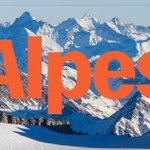
Introducing Alpes — a condensed grotesque superfamily in six weights with both standard and mono cuts, designed by Johan Mossé and Quentin Berthelot of Image Format.
shrptyp.co/alpes / shrptyp.co/alpesmono


Alpes works at scales monumental to miniature, from editorial summits to technical base camps.
shrptyp.co/alpes / shrptyp.co/alpesmono


Alpes Mono is the fraternal twin peak with a cooler climate, refined for coding legibility and branding that needs a chiseled quality without losing liveliness.
shrptyp.co/alpes / shrptyp.co/alpesmono


🏁Rotina Standard 🏁
The foundation of the Rotina ecosystem.
The standard cut of Rotina is a high-IQ sans that brings a fresh set of eyes to the most everyday style of type. Rotina was drawn with care, discipline, and a quiet friendliness that sets it apart from the classics that inspired it.
Designed by: @ErikMarinovich
Explore Rotina: sharptype.co/typefaces/rotin…

It was created to be functional yet full of character - the dependable sans you reach for instinctively, but one that rewards playfulness.🎯🎯🎯

