

Brand Systems, Typography, Motion & Digital Media Design - contact.erickv@gmail.com
Venezuela
Joined September 2017
- Tweets1.5K
- Following74
- Followers2.7K
- Likes14.9K





Pinned Tweet
Check out new work:
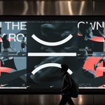
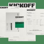
"KICKOFF™ — Premium Football Sports Agency"
Collaborators - @byMDZ_
You can view here → be.net/gallery/252580033/KIC…


Clean alignment starts with how you set up your bounding boxes.
Always align text boxes to the actual baseline/cap height of the font, not the default bounding frame.
Micro-adjustments are what separate amateur layouts from senior-level visual systems. 📐✨


"Looks great, but can we make the logo bigger?"
We've all heard it. But 9 out of 10 times, the solution isn't making the logo larger, it's giving it more negative space to breathe. 💡
A common mistake when starting out in design: wanting EVERYTHING to stand out.
If everything is bold, nothing stands out.
If everything is colorful, nothing pops.
Visual hierarchy isn't about what to add, it’s about knowing what to let rest. 👁️✨


