

friendly neighbourhood otaku, design at https://xitter.cf/t.co/qtFsPrnxOA
Joined December 2011
- Tweets1.1K
- Following1.4K
- Followers2.8K
- Likes727



Framer subscription seemed like an unnecessary expense, so I moved my portfolio to custom. Cloudflare for the win! Made it a bit Liquid Glass-ish in the process. pankajkaushik.me
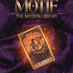
Motif phase 2: moved from GitHub Pages to Cloudflare so no personal access token required. Anyone on the team can use it.
We were paying $300/year for LottieFiles, mainly using it as a shared repository so the whole team could access animations. Seemed expensive for what we actually needed.
So I built a simple free alternative on GitHub Pages. Designers drag and drop a Lottie file, it goes live in a shared library with a preview, searchable by anyone on the team.
Next phase: Moving it to a separate hosting as GitHub Pages require a one-time setup for each member uploading animations
🤖 Made with AI

Been building internal tools for our design team
• When Figma released Variables, our old Styles became obsolete overnight. Every existing file was suddenly out of sync.
• Around the same time we introduced a dedicated numeric font for prices, stats and percentages, great decision, but muscle memory is brutal and old ghosts aka old Figma files came back haunting.
Both problems quietly accumulated across every file. So I built a Figma plugin that catches both. Scans the entire file, swaps deprecated styles to the correct variable in one click, and flags every numeric string not using the correct typeface and fixes it.
Posted inspired from a cafe I visited recently where they had marketed their sourdough starter 🙈
🤖 Made with AI

Recently worked on a lottie animation to make the screen transition smoother. Sadly it has not been implemented yet due to lottiefiles limitations of a certain tech stack. Been looking for an alternative.
Keep sound on max vibes!
Tried Pencil design tool recently. It is dope!
Those who don't know, it's an AI enabled design tool where you can just connect your Claude Code or Codex and start designing!
Design tip: when presenting modals that lead to persistent UI elements (like a wallet icon): Don't slide the modal out from the bottom while popping the icon in at the top. It breaks the visual connection.
Instead, shrink and transition the modal directly into the icon's final position.This simple animation shows users exactly where their info now lives and how to access it later.
Apply it anywhere you want to guide discovery after closing a modal.
Combined two Lottie animations into a seamless loop in @figma Make.
Used to be buggy prototypes or long dev explanations.
Now I just build the demo myself. Vibecoding changes the workflow.
🔊 Sound on!!
@LottieFiles
Polished it more to make it on-brand. Feel free to play with it yourself here - apycalc.netlify.app/

Been vibecoding an APY calculator in @figma Make. Surprisingly, it replicated the designs 100%, with animations and interactions generated entirely through prompts.
Adding in custom fonts and fun modals next.
Interaction tip: add a subtle scale-down effect to make the press feedback clearer and more satisfying, improving perceived responsiveness
Design file hygiene translated to better implementation, such as naming all layers, using auto-layouts, no unnecessary groups, also I wrote detailed, specific prompts like how I would explain something to a developer and didn’t leave things for ai to imagine.

Been vibecoding an APY calculator in @figma Make. Surprisingly, it replicated the designs 100%, with animations and interactions generated entirely through prompts.
Adding in custom fonts and fun modals next.
Recently, I started a weekly sharing series at work where I highlight one interaction improvement in our app, and I’ll be sharing these here as well. Last week’s:
Issue:
On the Home screen, too many sticky elements limit browsing space, especially on smaller devices.
Proposal:
Collapse the nav bar on scroll and shift quick actions upward to free more space.
Why:
Once users start scrolling, browsing becomes the priority. Reducing stickiness makes the experience cleaner and lighter, similar to Phantom, Trust, and Rainbow.
Turn the splash screen into a smart loader so the Home screen can initialize behind the scenes for a much smoother transition.
I split the Lottie into two parts: a one-time logo intro and a shimmer fallback loop, though your approach may vary.
Tiny change, big perceived performance lift.
P.S: portfolio numbers in the video are just placeholders, not financial advice
Slight background @LottieFiles animation to make Exclusive Quests feel more exclusive.
Sometimes the smallest visual tweaks create a good sense of polish.