

🎨 Artist I Work(ed) with @/G2LeTsHe @/Vaclav-Tomanec @/LarryKingExclusive + more!
- Tweets6.5K
- Following408
- Followers972
- Likes3.5K
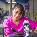







ALT A woman in a bright pink shirt and black gloves holds a black-and-white high-top shoe upright beside a handheld tool in a studio. A ring light enters the upper-left corner, with chairs and equipment in the darker background.

ALT Two people seated in a brightly colored convenience store hold up whiteboards. The woman on the left holds a detailed portrait of the man; the man on the right holds a rough sketch of the woman. Markers sit on the red table between them.

ALT Version 1: a bright group thumbnail on a boat, with a man in a reflective vest in the foreground and women around him. No text or arrow.

ALT Version 2: the same boat group thumbnail, with large white KYLEE text and a yellow arrow pointing to the woman in blue on the left.


