

Product mockups for designers, by designers. Create in browser or Figma (No Photoshop!)
Joined March 2014
- Tweets295
- Following186
- Followers590
- Likes1.8K



Mockuuups Studio retweeted

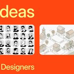
Great read about @Mockuuups rebrand mockuuups.studio/blog/post/m…

Most "gift guides for designers" are just affiliate link farms telling you to buy a $400 chair they already researched
Here's what actually works (and why your designer friend will remember it)
🧵

Want the full breakdown with specifics on each gift?
Wrote it all out here: mockuuups.studio/blog/post/g…

Mockuuups Studio retweeted

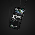
Navbar from Mockuuups Studio ↓
navbar.gallery/navbar/mockuu…
1/ In 2014, we needed a domain for a side project.
mockups.com was taken.
So we added letters. Mockuuups. Three U's.
For years, those three U's felt like a mistake we were stuck with.
Here's how we turned a liability into our biggest asset 🧵
10/ Search Pinterest for "macbook mockup"
6 out of 15 top results are ours. Instantly recognizable.
Those print mockups people requested? Live now.
The system finally stretches without breaking.
Full story: mockuuups.studio/blog/post/m…
9/ We didn't do a big announcement.
Just shipped gradually: → Pinterest first (testing) → Logo interactions → Category naming → Motion design (year later)
Self-funded = self-paced
The brand evolves as we do.
8/ We built a placeholder system using TV test pattern metaphor.
Signal bars = "content will appear here"
Acid green + abstract stripes = instantly recognizable
While competitors went minimal, we went distinctive.
7/ We customized Inter font (thanks @rsms) to give vowels a pixelated treatment.
Problem: SEO doesn't like "Compuuuter"
Solution: Stylistic sets
→ HTML: "computer"
→ Display: "Compuuuter"
Search engines happy. Brand distinctive.
6/ The breakthrough: "What if you made the UUU the system?"
Instead of hiding the triple letters, apply them everywhere.
Mockuuups → T-shiiirt → Compuuuter
Our reaction: "Maybe too much triples?" 😅
But it made sense.
5/ Sometimes you're too close to the canvas to see the composition.
After years of trying alone, we brought in Studio Najbrt and @michaeldolejs.
Not to execute our vision, to explore with us.
4/ The real issue: we kept redesigning, but never built a real system.
Support tickets asked for print mockups. Posters. Billboards. T-shirts.
We had the skills and infrastructure.
Just not a brand identity that could grow with us.
3/ As the business grew, we kept trying different approaches. Nothing stuck.
We wanted consistency and long-term focus. But we never built a system that could last in both our communication and product.
Something always felt off.
2/ The confusion started immediately.
People misspelled it constantly. Two U's, four U's, every combination.
We bought mockuuuups.com and other variations just to catch traffic.
Last year? Over 1,300 people hit those redirects.
