

Making Clickable Thumbnails • Thumbnail Designer & Strategist • Work(ed) with: @ItsManuelBoza, @JDubTrades_, @TheCodaGuy, @WaqarAsim10 + more
Toronto, Ontario
Joined July 2017
- Tweets10.3K
- Following908
- Followers2.3K
- Likes50.6K





Hammad retweeted

October 5, 6AM UTC 👀
Mark your Calendars NOW
calendar.app.google/cgaFjcia…

🚨ATTENTION THUMBNAIL STRATEGISTS🚨
I used to be exactly where you are. A designer, worried AI would replace me.
So I moved into strategy.
It's not hard. It's just never taught.
That's why @TNAcademyPlus and I built Fall Camp.
Oct 5, 6 AM UTC. 4 days left.
Reply "Fall" to get your seat.


A simple way to create curiosity in a thumbnail is to show progress
When viewers can clearly see that something changed, they naturally want to understand how that change happened.
Here are 3 ways to show progress:
1. Before & After
Show the starting point next to the final result
In the example, you immediately see the difference between “Newbie” and “Pro Editor.” The viewer sees where they started and where they ended, which makes them want to know how that transformation happened.
2. Timeline
Show the different steps someone needs to go through to reach an outcome
The software engineering example creates a clear path from starting to learning skills to getting the job. Each step helps the viewer understand the progression and what the video will take them through.
3. Increasing Scale
Show something gradually increasing, evolving or becoming more advanced
The iPhone example shows multiple generations together, going from the earlier models to the newer ones. You can immediately see how the product has evolved over time
Progress is naturally interesting because there's a starting point and an outcome. The bigger or more interesting the change between them is, the more reason the viewer has to want to see how it happened


When most people think about contrast in thumbnails, they usually think about colour. Bright subject on a dark background, red against green, white text on black, etc
But contrast can be created in a lot more ways than that
You can use:
- Size: Put something tiny next to something massive
- Time: Then vs now
- Condition: Broken vs restored, messy vs clean, old vs new, etc
- Emotion: Put two completely different reactions next to each other
The bigger the visual difference between two elements, the easier that difference is to notice and understand.
This is why comparison thumbnails work so well. You can understand the basic idea almost instantly and the difference between the two sides gives you something to want to know more about.
So when you're looking for ways to create contrast, think about colours, yes, but also look at what you can make noticeably different


The only scroll stopper guide you need for thumbnails:
Before someone can understand your thumbnail or become curious enough to click, you first need to get their attention
There are a lot of ways to do this, but most scroll stoppers fall into a few simple categories:
- Emotions:
Faces naturally grab attention, especially when the emotion is easy to read
Shock, confusion, excitement, anger, fear, disgust. The stronger and clearer the expression, the easier it is to notice
- Danger:
We naturally pay attention to things that look threatening, risky or like something is about to go wrong.
Extreme heights, dangerous animals, disasters, or anything that creates a sense of risk can immediately pull your eyes toward it
- Large Numbers:
Big numbers are easy to process and can instantly communicate scale.
Money, views, subscribers, percentages, time, distance or any other impressive number can work as a scroll stopper
- Aesthetically Pleasing:
Sometimes the visual itself is enough to stop someone
Strong colours, symmetry, satisfying compositions, interesting artwork, clean 3D renders, or unusual visual styles can stand out simply because they look good
Usually, one strong scroll stopper is enough to get the viewer's attention. From there, the rest of the thumbnail needs to clearly communicate the idea and give them a reason to click.

An easy way to make your thumbnails feel more intentional is through composition. Where you place the elements determines what the viewer notices first and where their eyes go next.
There are a few ways you can guide the viewer's attention through composition:
- Leading lines: Use elements within your thumbnail to create natural lines to guide the viewer toward your focal point
- Arrows: Direct attention toward a specific detail
- Scale: Make the main elements larger and supporting elements smaller to create hierarchy
- Blur/Depth: Separate the foreground, subject and background to make the important elements stand out naturally

Curiosity is the biggest reason someone clicks on a video.
The goal is to create a curiosity gap, the gap between what the viewer currently knows and what they want to know. The wider that gap is, while still keeping the idea clear, the stronger the urge to click can become.
Here are 4 thumbnail formats that create curiosity gaps really well:
1. Moment
Capture a moment where something is about to happen, or where the viewer is waiting to see the outcome
In the example, the thumbnail shows the exact moment someone asks Will Smith if they can come inside to watch football.
You immediately want to know: "What is his reaction?" "Does he let him in?" "What happens next?"
The thumbnail gives you the setup, but the outcome remains unknown.
2. Question
Create a question in the viewer's mind without necessarily writing the question itself
In the example, you see two similar images with 23M on one side and a pixelated number on the other side.
By hiding that number, the thumbnail creates a missing piece of information that the viewer can only find out by clicking on the video.
3. Transformation
Show a clear before and after
The viewer can see where something started and where it ended, but they're missing the most important part: How did they get there?
This works especially well for makeovers, fitness, builds, challenges or anything with a noticeable change.
4. Novelty
Show the viewer something unusual that they probably haven't seen before
A car being cut in half with a lightsaber is immediately interesting because it's outside what we normally expect to see or even something we will never see.
Novelty can come from an unusual object, situation, scale, location or action. The unfamiliar visual naturally makes people want to understand what's happening.
These aren't the only ways to create curiosity, but they're four formats that consistently give the viewer a reason to want more information
Moment: "What happens next?"
Question: "What's the answer?"
Transformation: "How did that happen?"
Novelty: "What am I looking at?"
A strong video idea will usually have a curiosity gap naturally. The thumbnail's job is to visually communicate that curiosity without misleading the viewer or making the idea confusing


There’s a reason faces are so common in thumbnails
Our brains are incredibly quick at detecting faces. We can recognize a face, read the expression and get a sense of the emotion before we’ve fully processed everything else in the thumbnail
The thing is, text takes a little more effort. The viewer has to notice it, read it and understand what it means. A face can communicate fear, excitement, confusion, anger or whatever emotion instantly
Not every thumbnail needs text. Plenty of great thumbnails don't have text
But when you do use it, use it with purpose. Let the text add something the face couldn’t communicate as effectively on its own
I like to think of text in thumbnails as serving one of four purposes:
Context: Give the viewer extra information that the image alone can’t communicate
Scale: Communicate size, money, time, quantity or the magnitude of a result
Clarity: Help the viewer understand an unfamiliar or abstract visual
Curiosity: Leave an important piece of information unanswered and give the viewer a reason to click

When you do use text in your thumbnail, it should usually serve one of these four purposes:
1. Context
Use this when the thumbnail needs a little more information to communicate the idea
In the example, "White Gold" completely changes how you interpret the thumbnail. Instead of seeing a block of ice, you immediately realize it's something valuable
2. Scale
Use this to show size, quantity, money, time, etc
Numbers are a good way to do this. "$54,000/month" quickly tells you what's at stake. Before you've even read the title, you already understand the scale
3. Clarity
Some topics are too abstract to understand from the thumbnail elements alone
The text "THIS IS A MEMORY" tells you what you're looking at. Without it, most people would just see a colourful pattern
4. Curiosity
Use text to create a curiosity gap by leaving something unanswered
"Don't Trust Them." doesn't explain anything. It simply makes you want to know who they're talking about and why they shouldn't be trusted
Not every thumbnail needs text. In fact, many of the best thumbnails don't use any at all. But if you do add text, make sure it's serving a purpose. If it isn't doing any of the 4 I mentioned above, it's probably better left out.

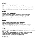
What actually makes a clickable thumbnail?
Most thumbnails only do 1 of these 3 things effectively. Here's what great thumbnails do differently
Goal #1 is Attract: This is about HOW your thumbnail stands out
The goal is to stop the potential viewer from scrolling past your video on the YouTube homepage. This can be done with Scroll Stoppers
Use: Bright Colours, Contrast, Text, Branding, Glows, Faces, Aesthetically Pleasing thumbnail, Weird/Unique Element and there are many more ways to do this!
But it is a crucial part that determines if your thumbnail will be successful or unsuccessful. This is because if the first goal is not achieved, by which I mean if the thumbnail doesn't stand out, the next two goals are of no use.
Goal #2 is Convey: HOW does a thumbnail communicate the video's value?
The thumbnail needs to instantly tell the viewer what the video is about. no confusion, no guessing. The viewer should understand the topic, the tone, and why it's worth their time all within 1-3 seconds.
The combination of the elements in the thumbnail should leave zero doubt about what the video delivers
Clarity has to come first. Once they understand what they’re looking at, THEN the curiosity gap (THIRD GOAL) gets the click.
Don’t make the viewer try to figure out or understand what your video is about. It needs to be as clear as possible and then aim to leave an open loop that makes them ask a question they need to click to answer
and finally...Goal #3 is Intrigue: How does a thumbnail create curiosity?
For this, you need to use a curiosity gap, which is the gap between:
What a Potential Viewer Currently Knows vs What a Potential Viewer Wants to Know (the wider that gap, the stronger the urge to click)
There are a few ways to effectively create a curiosity gap by using certain thumbnail formats:
1. Moment: shows a moment right before a powerful reaction. The viewer wants to know what happens next
2. Create a Question: Introduce a question into the viewer's mind that they want the answer to
3. Transformation: Show the start/before vs the finish/after
4. Novelty: Elements in the thumbnail that the viewer has never seen before
But you should not mislead the viewer in pursuit of achieving this goal. If your video idea is good, then the thumbnail concept you choose should have a curiosity gap naturally.
What I have seen time and time again is that most thumbnails fail at step one and never get a chance at the other two. Nail all three and impressions will become clicks

Another big mistake thumbnail designers make is designing at 100%+ zoom
Your viewers will never see your thumbnail that large. They'll see it at a fraction of the size on the homepage
A habit I've built into my workflow is zooming my canvas out to 10-15%. If I can instantly recognize the subject, understand the idea and read any important text at 15%, I know it's likely to hold up when people see it on Youtube
As you're designing, constantly zoom out and see:
- Can I still tell what the main subject is?
- Is there anything that's only visible when zoomed in?
- Is the thumbnail understandable in a second?
