







Cultivating a creative community with Tina Roth-Eisenberg of Creative Mornings: ow.ly/y8aH50ONFab

Ad Fontes Media: 5-Minute Methodology Review ow.ly/5xIP50OLufx

Introducing Microsoft Fabric: Data analytics for the era of AI, integrating technologies like Azure Data Factory, Azure Synapse Analytics, and Power BI into a single unified product ow.ly/QEwz50OGm7T

27+ (Secrets) on How To Create An Awesome Viral Infographic in 2023 - great content and tips, but not a great infographic (sadly) coolinfographics.com/blog/20…

Chart Reader: Accessible Visualization Experiences Designed with Screen Reader Users: ow.ly/Gg3c50OGm3a
Finding the Right Elements For an Award-Winning Dashboard: nightingaledvs.com/elements-…

Check out the new page for the Open Climate Data project from Creative Commons which launched in Spring 2023, to facilitate the opening and sharing of climate datasets and data models available across the globe. ow.ly/EWhS50OAmHw

How to maximize your marketing content and reach every audience you want: ow.ly/EaIe50Ov2Xf

New paper from Robert Kosara: Notebooks for Data Analysis and Visualization ow.ly/qCwm50OsXyK

Why are six colors common in color palettes for data visualization? by Jon Schwabish ow.ly/vnvP50Ol35V


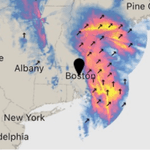
A Eulogy for Dark Sky, a Data Visualization Masterpiece (Dark Sky was my favorite weather app!) ow.ly/OKCY50Ol343

Chart Reader is a web-based accessibility engine that generates charts that integrate with screen readers. ow.ly/yxM950Ol32V

How Making Data Physical Could Help Us Care for the Planet: ow.ly/GGIM50O7jMj

The reason Fernando is using Altair for most of his visualization in Python: ow.ly/XNWb50O7iMF


The Data Visualization Society State of the Industry data for 2023 is out, The State of the Industry Survey Challenge has started to visualize the results. Submissions are due May 14 ow.ly/7jC250NVUtR
