

Curious marketing, advertising, strategy minds unite | Talking brands, ads & creativity | Piquing your interest with povs on the good, the bad & the ridonculous
Joined December 2021
- Tweets4.9K
- Following5.3K
- Followers6.4K
- Likes35.2K





Pinned Tweet
Interesting set of aesthetics chosen by #SabrinaCarpenter and her team to market her new album ‘Short n’ Sweet’. A good dose of VINTAGE / RETRO underpins some of these collaterals.
Drawing inspiration from classic 70s-style billboards which musicians like Donna Summer and others would have up all over LA / Vegas back in the day- you know with cut-outs of the face / instruments or text jutting out past the edge of the frame (see quoted tweet). Also, is Sabrina attempting to channel some pin-up energy here (à la Anita Ekberg in a similar poster for The Temptation of Dr. Antonio)?
The CD and vinyl booklets are based on even older print ads and classifieds of yore. Her songs’ lyrics make up all the copy. The typeface on them plus the layout is reminiscent of what you’d see in an old advert from the 50s of say a Campbell’s or Dove.
Not sure if other artists have tapped into this theme lately. Nevertheless, will hand it to Sabrina for trying to cut through / to revive an old style and presenting things with a certain degree of panache. It may not necessarily have wide appeal as such but feel that her audience, even with no reference of the past, will likely take to it for its novelty if nothing else.
#Marketing #MarketingTwitter #Advertising #OOH #Music #ShortnSweet #DonnaSummer
[CD booklet images via Ruby Naldrett]


These classic 70s billboards ft. disco queen #DonnaSummer are such beauts.
That there was always space and then some for her iconic tresses is just marvellous 🤩
Musicians don’t do billboards with personality like this any more, do they? Like proper traffic-stoppers.
#OOH #Music #Advertising #Marketing #MarketingTwitter
[h/t fan account ALoveTrilogy for the throwback]


BrandGully retweeted
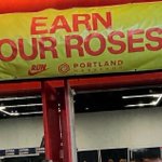
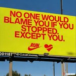
Another season of marathons. Another set of words by #Nike for out-of-home.
In #Chicago and #Portland the last couple of weekends.


It’s that wonderful time of the year again when #Nike’s copy and media crew are out and about at the marathons.
#Chicago today. #Portland last weekend. And per usual, they delivered. Billboards lining the route, dripping with wit. Signature Nike.
Love these.
PS- For throwbacks from last year, icymi, check out all the quoted posts linked below.
#Copywriting #Advertising #OOH #Running


Another season of marathons. Another set of words by #Nike for out-of-home.
In #Chicago and #Portland the last couple of weekends.
It’s that wonderful time of the year again when #Nike’s copy and media crew are out and about at the marathons.
#Chicago today. #Portland last weekend. And per usual, they delivered. Billboards lining the route, dripping with wit. Signature Nike.
Love these.
PS- For throwbacks from last year, icymi, check out all the quoted posts linked below.
#Copywriting #Advertising #OOH #Running
This is lovely by #Oura and their creative partners. Beginning to outdo themselves with every passing campaign.
Main film BTS
Gorgeous work by #DeLonghi turning some of their coffee machines into miniature coffee shops, that too with the machines still fully functional. It’s all in the details. Piecing them by city ie. Paris, Tokyo, Milan, Copenhagen and Berlin.
The whole discourse in marketing / ad circles around AI vs human craft aside, it is interesting to note that within the realm of craft alone there’s a mini battle brewing between oversized and miniature this year.
Oversized installations (the real ones, not the computer-generated monstrosities) as a creative expression has had a solid run for a good 2-3 years now and is showing no signs of bowing out any time soon. In fact, it will always gather max eyeballs in the real world, such is the nature of the concept.
But gorgeous miniature work like this, with all the finesse and sheer effort behind them, is going to have its own appreciation club.


Liking this 2032 Brisbane #Olympics & #Paralympics logo. Glad it’s not abstract.
Inspired by the Australian cockatoo. The crest does double duty - representing the Olympic flame while its outline is kind of shaped like the state of Queensland with Brisbane as the eye. Geography nerds would appreciate.


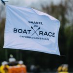
First signs of #Chanel warming up to the idea of being a little more out there, a little more involved on the ground vs just lending their name and money to the Cambridge v Oxford Boat Race in the UK.
Entering the third year of this association, they’ve now assumed the mantle of designing the silverware for the winners w/ designers from their watch division taking over, which is why the black and white treatment comes as no surprise- looks like a direct nod to the Chanel J12 watch. White frame on the women’s trophy, black on the men’s. Both trophies now identical in size too- don’t see that often in sports.
Have it on good authority that Chanel’s been trying to figure out how best to approach this partnership by the year and calibrate based on their learnings after each edition. After all, The Boat Race remains its first and only title sponsorship of a sports event anywhere in the world. Getting involved with these trophies is a good and balanced progression in that sense, without having to overplay your house or brand codes.
>>>


BrandGully retweeted

I know a lot of the territory has been covered already by excellent "premium mediocre" articles.
But accountants and mass affluence, and abundance culture, and optimization thinking really is a scourge .
I was in Grand Central yesterday, and you can just feel the solidity, the pride, the materials. There is a generosity. A dignity Hey dignity.
And then you're in some Chase private lounge, and everything is fake plants, vegan leather, fake marble in the toilet, cheap orange juice, some weak single origin coffee, it's like, what does one have to do these days to have something that feels heavy.
Somehow, we just decided we should have a lot of everything. Rather than a small amount of great stuff
How many million do you need to spend to have freshly squeezed orange juice? At what class of hotel do you get brass lighting? It's like everything's designed to look good on Instagram. And people can happily raise money for capex, but never for opex.
Safe to say every year now seems to have a little dance-off, if you will, among brands ie. a month-long window when a whole host of them, not just in apparel but across categories, happen to drop their dance-heavy spots within weeks of each other. Like there’s something in the air.
2026 has been no different. Just in the last couple of weeks alone- Peloton, CK, Reebok, Nothing have put out their song and dance routines. Not even counting GAP here, pretty much a year-round thing for them anyway.
>>>


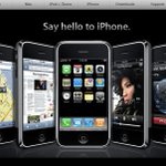
And again. Not a year goes by without #Apple saying “Hello _____” in some form or the other on a billboard, mailer or landing page to introduce its new offerings.
Very basic by copywriting standards yes. That they’ve been doing this quite unapologetically for years now makes you wonder if internally there’s an unwritten rule that requires the team to (begrudgingly) slide in these Hellos in the headline, as a soft callback to Apple’s no-frills commercials of yore (Macintosh iPod for eg) from the Steve Jobs era? Plus, Apple screens have been greeting us with “Hello” since forever. Whatever the case, they’re definitely aware of its repeated usage. A tiny, banal Apple-ism of sorts.
>>>


These look beautiful. #Clarks Shoes made the trek to Mongolia to shoot their AW’26 collection. Worth the effort this one. That neck of the woods and Central Asia more broadly is so different and remains a relatively underused visual territory in brand campaigns. And that is not necessarily a bad thing. Perhaps a lot of the appeal lies in it staying that way.
That said, wonder if some of the new-found attention around the recently concluded World Nomad Games in Kyrgyzstan would’ve made more brands and creative teams take note of the vast and beautiful canvas these places offer for telling stories. Likely, although a proper brand-connect, budgets and logistics would always be a factor. Nomadic excursions like these are not everyone’s cup of tea. Should be interesting to keep an eye out though.


So next on #On’s radar is golf, per their investor note today. What’s to say they won’t follow the same Thierry Henry-Kylian Mbappe type of playbook for category legitimacy?
But then who might be golf’s Henry-Mbappe? Rory, Scottie are tight with Nike. Gut says they’ll go with one of the European guys. Tommy Fleetwood could be a good match? Let’s see. Just fun to speculate.


BrandGully retweeted

I am by no means a "Disney person," but this makes me sad. It looks / feels like something that was decided upon by committee on a spreadsheet, not by a group of people looking to maximize joy and whimsy. It's laid out like a Best Buy or airport retail shop, there isn't a ton of color or movement or any of the dynamism of their IP. There's nothing for kids to instantly react to in a moment of unabashed joy upon walking in.
IRL retail is a chance to communicate what and who you are as a brand. This feels like an abject flop.

🛍 First overall look at the Disney Wonders shop, which officially opens this Tuesday, September 22 at Disneyland Paris!
The venue is meant to be much more spacious than before, with the aim of easing customer flow between each aisle, offering greater product visibility at a glance, and making it easy to spot each franchise in one look. Efficiency was the watchword of this refurbishment, we can say that.
(1/2)
.
#DisneyCastLife


Hmm .. #Nike to introduce Jordan Brand fitness equipment on top of their own swoosh line. Pretty much the same equipment. The branding looks solid alright. Wonder what the Jumpman premium will be. And will any premium be significant enough for Nike to not be too concerned by any cannibalisation?


Barca had unveiled a beautiful new custom typeface for their kits back in June w/ some really nice flowy and wavy detailing on the jersey numbers, drawing on the rich visual language seen in the region’s architecture.
But it is such a pity to learn that the new type cannot be used for jersey numbers during La Liga! Champions League yes, Copa yes, but not La Liga, as was evident in last night’s match vs Racing Santander (see last pic). All because of the league’s standardised typeface for teams. So then why go through the trouble of creating a distinctive piece of club identity in the first place if the very competition, in which audiences are likely to clock it most often, is the one where they can’t use it? Don’t get it. What a dampener, unless there’s more to it that is not immediately obvious.


Arguably, nobody in luxury is as committed to posting their OOH from the wild on main as #BottegaVeneta. Standard operating procedure for them. Became a thing during Matthieu Blazy’s time and continues w/ Louise Trotter.
Said this before as well- wish brands put out real-world billboard photographs as a follow-up more often vs just circulating over-produced polished mockups or renders to the press. Make it the norm.


Incredible to think that #Apple continues to draw on the silhouette-led visual language to this day in some form or the other across its creatives for the AirPods. This after debuting it more than 20 years ago in that iconic and sexy af iPod campaign.
Wires or no wires- doesn’t matter, the treatment has lived on through successive generations. Safe to say it’s their signature now. Not quite as colourful as it used to be, but that’s alright. The art team behind the original iPod work must be a happy and proud lot though.


Not #David referencing (and almost parodying?) the key visual of Rhode’s glazing milk skin essence from 2023 in this launch video for their new protein milkshake. The punchline “Drink it”, as straightforward as it may seem, also doubles up as a wink at Rhode.
But the larger point here is that #Rhode continues to live on many a moodboard in CPG.


No, #NudeProject. You did not just do that! Straight up reproducing the classic 1985 #TommyHilfiger billboard for your socials, all in the name of inspiration?
Whatever the intention, this is just lazy work vs doing something original esp given the times we live in. Imagine how’d the late George Lois (the OG behind the Tommy creative) feel about this? Flattered or up there somewhere shaking his head?
2026 1985


BrandGully retweeted

Coming back to this bc the more I see about the state of nike, the more I get sad. Everyone w/in the walls at this time disagreed with this strategy. We hated it. There was no room for creativity anymore. No room to take a swing or a chance. Everything was based on metrics…

How to destroy a beloved brand.
Step 1: Put a soulless, data-driven consultant who has never even seen a basketball court or a running track up close in charge.
Step 2: He goes direct! And increase profits while destroying the retail distribution system and betraying a multitude of 20-year-long partnerships.
Step 3: Motivated and innovative competitors like On Running and Hoka rush to fill the distribution gap Nike left by abandoning its trusted partners.
Step 4: Not satisfied, he fires all the stupid creative people who can't prove any of their ideas work with hard data. What could they possibly know?
Step 5: Celebrate when milking the brand for every last cent works for about 18 months, even though the data quickly show a disaster is looming.
Step 6: OMG? Wut?
Step 7: Fire the old CEO and bring in a new one who's been with the brand since day one. He tries his best, but just too much damage was done.
Step 8: Get delisted... Go down in history as the greatest example of data-driven idiots destroying one of the most successful creative brands of all time.
The end.
Dig this new out-of-home series by #AG1 because 1) the idea is born out of a real consumer pain point / travel anxiety 2) the copywriters did great and more importantly 3) their counterparts in media would’ve likely worked their airport contacts hard to get the requisite approvals, which may not have been as straightforward as it seems given the subject?
Creative x media working in tandem to give us some contextual #OOH esp in transit environments like these. Love to see it.
>>>


