

Lettering for names that get worn Clothing brands & labels · since 2010 Carhartt WIP · Adidas · Montana Cans and many others
Moscow-Tver
Joined June 2009
- Tweets7.6K
- Following198
- Followers2K
- Likes319
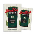


I had the pleasure of being included in the Speedball Textbook again (26th edition). It’s truly an honour to appear alongside masters such as Villu Toots, John Stevens, Julian Waters, Luca Barcellona, and others.
Special thanks to Carl Rohrs for inviting me to contribute!


One thing I’ve learned after years of drawing letters is that the hardest part is optical balance.
This differentiates custom lettering from standard typefaces in logotype design.
Custom lettering is contextual.
I love how vibrant and reflective the strokes look before the paint dries when drawing with acrylic markers on a glossy surface.


Recently I designed a new script lettering for ‘River Espresso Club’, a specialty coffee shop based in Minsk, Belarus. It was a fun project and a pleasure to work with the guys!


These are some of my Cyrillic works created over the past few years. Some Russian-speaking people think and say that Cyrillic, with its letterforms, is clunky, rough, crooked, and so on.
I will never understand why these people think this way and treat their own writing system.

This is my two cents for the @LogoArchiveNow
Not much space to show the full range of styles I work in and have been designed for more than 16 years of making lettering, so I packed in as much variety as I could, both for Latin and Cyrillic logos.
#logoarchive #logoarchive_now

Almost half a sketchbook filled with drafts and explorations for just one logo. Not counting other notebooks and loose sheets. That’s the usual process and volume for me. Behind one seemingly simple wordmark lies a huge amount of rough sketches. The most time‑consuming part.
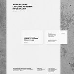
Final logo for a construction company from Saint-Petersburg, Russia.
The name translates as "Construction Project Management."
All letters were built from scratch; no fonts were used.
#branding #identity #logo #typography

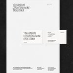
One of two options for a custom-built lettering logo for a construction company from Saint-Petersburg, Russia.
The name translates as "Construction Project Management."
All letters were built from scratch; no fonts were used.
#logotype #typography #lettering #graphic_design


Logo for the Comic Kult online comics store
During the project, I developed several concepts. Ultimately, during the finalization stage, at the client's request, I created a blend of two concepts that were overall quite similar.
Open for new commissions.


My name is Sergey, a man of beautiful letters.
Here're a few facts about me:
> I've been writing and drawing letters for more than 15 years.
> I haven't attended a single class, workshop, or course.
> I am self-taught and learned everything on my own. And I'm still learning.


Handwriting Russian word Четверг (Thursday) with a brushpen #handwriting #shapiro_writing #brushpen #calligraphy

