

Building and growing the Brands of Tomorrow™
Manchester
Joined November 2012
- Tweets1.7K
- Following2.1K
- Followers2.9K
- Likes1.2K



A visual system of minimal, black and white overlapping lines references Scouted’s painstakingly curated nest. Featured throughout the brand and in their packaging, it becomes a little piece of their home delivered directly to their customers.#packaging #packagingdesign #branding

We developed a brand concept based around curation. A script wordmark sits alongside their hawk motif, poised and ready to swoop in on fresh brands and exclusive collaborations. #logodesign #logo #branding #brand #design #graphicdesign #manchester #wordmark #fashion
Scouted are a hawk-eyed fashion retailer founded by Fraizer Campbell. They champion new and undiscovered brands, bringing them together to create an exclusive virtual wardrobe for people who want to stand apart from typical high street establishments.#logodesign #logo #branding
Visit ahoy.co.uk/work/tickx/ to check out the case study.
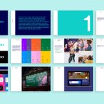
We supplied everything the TickX team needed to implement the brand both visually and through our messaging framework.
#branding #design #website #webdesign #ahoy #portfolio #graphicdesign #brandidentity #Ticketsales

We applied the vibrant new branding to the TickX site and social media channels - replicating the energy and excitement felt when experiencing a live event.
#branding #design #website #webdesign #ahoy #portfolio #graphicdesign #brandidentity #Ticketsales

We chose a clear, stripped back approach for the TickX brand. A broader palette was essential to add more vibrancy to the brand, whilst a primary palette kept consistency for core communications. #branding #design #pattern #ahoy #portfolio #graphicdesign #brandidentity

The second approach was a clear and compelling messaging framework that allowed us to articulate these benefits to TickX’s broad audience groups.
#logodesign #logo #branding #brand #design #ahoy #portfolio #graphicdesign #manchester #brandidentity #wordmark #Ticketsales

We built TickX a visual identity that reflected the abundance of exciting attractions and impressive USPs TickX has to offer.#logodesign #logo #branding #brand #design #ahoy #portfolio #graphicdesign #manchester #brandidentity #wordmark #Ticketsales

TickX show every ticket available all in one place, so you get the best price and never miss out on the experiences you love. We helped position TickX as the place to discover those moments that matter. #logodesign #logo #branding #design #graphicdesign #brandidentity #wordmark

AHOY retweeted

⚠️FREELANCE DESIGNERS⚠️ I’m still looking for #freelance #brand and #web #designers for @AHOYStudio. January is looking incredibly busy—if anyone has any recommendations, PLEASE can you share here or email [email protected] Thanks, Tom
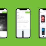
Visit ahoy.co.uk/work/imo-mobile/ to check out the case study. Our fully responsive design ensured that the IMO site looked great no matter which device or browser it was viewed from.
#branding #design #ahoy #portfolio #graphicdesign #technology #website #webdesign #UX #content

Visit ahoy.co.uk/work/imo-mobile/ to check out the case study.
We designed a fresh, contemporary, fully responsive site. The versatile page template design and CMS capability allowed for easy updates and developments as IMO grows and new devices are released and added.
An icon set was developed in a style that complimented the light weight typography. These icons were used throughout the site to highlight key features of products as well as assist in “way-finding” within the site.Visit ahoy.co.uk/work/imo-mobile/ to check out the case study.

Visit ahoy.co.uk/work/imo-mobile/ to check out the case study.
Tone-of-voice was developed to educate audiences around the definition of IMO. Matter-of-fact statements represented the thoughts and feelings of the consumer and encompassed the honesty and attitude of IMO.

Combining existing product shots with carefully considered stock photography formed a unique narrative for each phone model, as well as conveying the values of the brand.
#branding #design #ahoy #portfolio #graphicdesign #technology #website #UX #content #photography

Visit ahoy.co.uk/work/imo-mobile/ to check out the case study.
IMO specialise in affordable mobile communications. We were tasked with re-energise their online presence by creating a website that truly reflects the brand’s ethos and aspirations.#webdesign #design #ahoy #portfolio

AHOY retweeted
Evening all—I’m looking for #freelance #brand #designers for the next few weeks at @AHOYStudio. If anyone has any recommendations, please can you share here or email [email protected] Thanks. – at Salford, England
Once the wireframes were finalised we moved on the visual design, integrating the brand within the app using typography, photography, colour, pattern and motion flourishes.#branding #brand #design #graphicdesign #Identity #manchester #brandidentity #wordmark #app #appdesign
The design of the Use app started by identifying the core features and objectives. Users must be able to find, search for and use offers quickly and intuitively. With these objectives in mind, we created a working prototype.
#graphicdesign #app #appdesign #brandning #identity

Visit ahoy.co.uk/work/use/ to check out the case study. Playful, fresh and bursting with feel-good energy; the visual language of the brand encapsulates the experience of using an offer. This feeling of surprise and happiness when realising how much you’ve saved.
